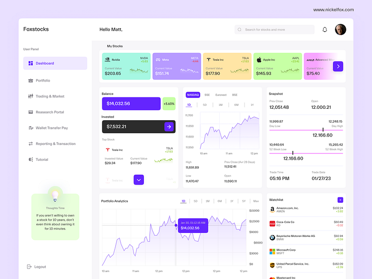
Fox Stocks Dashboard Analytics
Hello Dribbblers👋!
✨Check out our 👉 YouTube channel 👈 for the latest design inspiration and tips & tricks!
Introducing a fresh new concept dashboard for a Stocks investing platform.
--------------------------------------------------------------
Download the file link here
--------------------------------------------------------------
Have an idea? Let's talk here or WhatsApp
Follow us here:
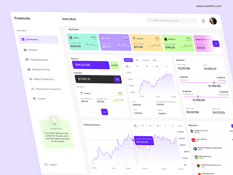
🔥Overall, the user interface design for the stock dashboard is user-friendly, visually appealing, and provides users with the information they need to make informed investment decisions.
🚀 With its clean layout, easy-to-use navigation, and real-time data, the stock dashboard is an essential tool for any investor.
Here are the specifics
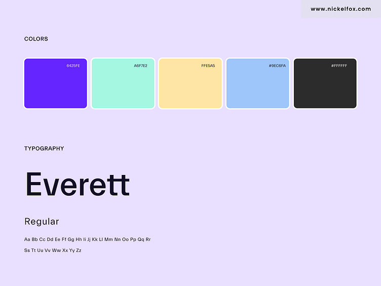
Colors
🎨Purple (#6425FE),
🎨Teal (#A6F7E2),
🎨Baige (#FFE5A5) - provides a clean look
🎨Black (#2C2C2C)
🎨White (#FFFFFF)
Fonts -Everett Modern Sans Serif font to provide a modern and fresh look.
I hope you enjoy exploring this shot.
Press 💖 if you like our design and share feedback!