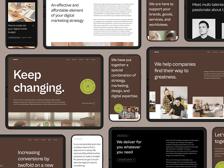
Keeper - Digital Agency Website
Hello everyone!
This is a website design that I finished working on, the website for a digital agency company called Keeper. Keeper is a team of branding experts, marketing strategists, digital merchants, designers, and growth programmers. Keeper uses the power of human psychology and their understanding of the digital landscape to help businesses attract customers.
I use a minimalist design style that is neat, functional, friendly, and informative. Brown is the main color that reflects the brand's sophisticated and professional value. Brown is used to conveying a warm and organic feel while giving the design a sense of stability and reliability.
You can see the prototype and live preview of the website here:
FIGMA PROTOTYPE or LIVE PREVIEW
Here is a glance preview of the websites I've worked on.
Home Page
Desktop Page
Mobile Responsive
Style Guide
What do you think? Feel free to share your thoughts in the comments!
Don't forget to "Press L" if you like it! ❤️
You can get this product at UI8 :


