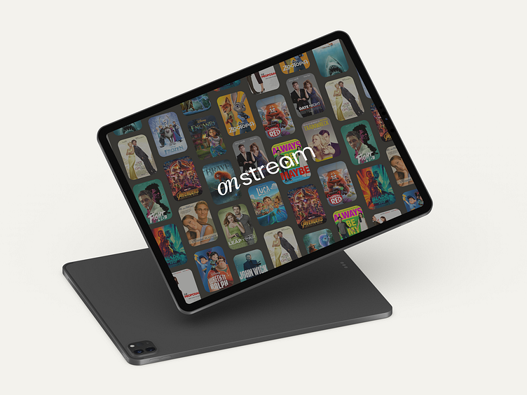
OnStream - Video streaming platform for the whole family
Overview
OnStream is a television and movie streaming service that has run into issues with users not being able to switch profiles quickly and easily. This brief was developed as a part of Dribbble’s Product Design course. For this project, I not only worked to solve the usability problem but I also created the visual design of the platform.
Problem / Process
The OnStream steaming service has determined that younger users are having trouble transitioning from their parents profiles to their own. Users as young as age 4 have their own profiles so they can access family friendly content, but sometimes it takes more than 10-12 movements on their tablet to get to a hidden profile switch screen.
Hundreds of user interviews have been conducted as well as basic user research. All signs point to the main complication being that younger users (ages 4-8) are having difficulty finding where the profile sections lives on the application, then not being able to navigate easily to their profile.
To solve this problem I started by outlining a user persona for the category of users having the most complications with the application. From there I outlined a new user flow to determine the fastest and easiest way for a user to navigate through it. Finally, I created the visual design for the application and applied it to the screens outlined in the user flow guided by the user persona.
Persona
The primary persona outlined is a child that fits into the younger demographic of users having issues with the application.
User Flow
Below is the user flow designed to show how different users will navigate through the application. The flow ensures a user is able to switch profiles quickly and it is as straight forward as possible.
Visual Designs
When designing this brand I wanted it to feel simple and easy to navigate since users are using the platform as a way to access their favorite shows and movies. It was also important that the adult and child interface were unique. A child should be able to identify when they are on the interface created for them.
Prototype
Check out the live prototype here!
Outcome + Result
Working on this brief pushed me in my problem solving abilities. This brief was different than others I have done because it was solving a specific niche problem within a larger application. I learned the importance of understanding the needs of all users and ensuring usability is straightforward for each audience.


