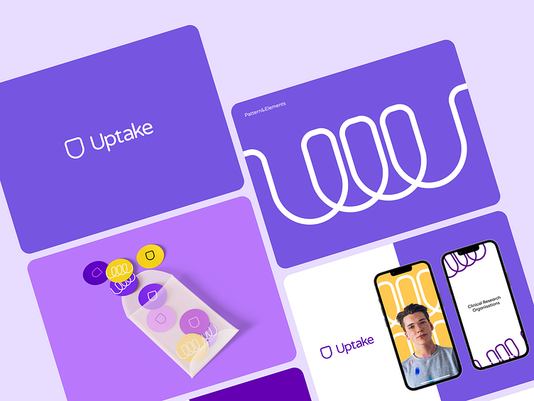
Uptake - branding design for a medical startup
Medicine could also a have modern look and feel.
More than 40% of all projects we had last year were related to branding projects.
Today we'd like to present you with one of those. Uptake is a startup in the medical niche. The general image of the brand is designed to attract the attention of the consumer and give positive emotions, which are incredibly valuable resources in the midst of everyday stress.
The set goal is achieved by eating colors and shapes that organically intertwine and create a feeling of fullness.
The logo design
The logo consists of two parts, the symbol and the font.
The symbol is a shield symbolizing protection and integrity, and the rounded shapes add to the overall softness of the image and fill it with organic empathy.
The negative space of the shield symbolizes the transparency and openness of the product to the consumer.
Color palette and typography
Based on the general image of the brand and that it is eager to give positive emotions the color palette is represented by 4 main colors, each of which conveys certain meanings:
purple - emotions
yellow - attention
black - fundamentalism
white - purity and space.
The font part is represented by a medium-saturated font with rounded corners, which, similarly to the shield, adds softness to the image.
Branding patterns and elements
The symbolic part of the logo is also the basic graphic element of branding, from which such elements as spirals are formed, which symbolize the connection between the consumer and the product and is emphasized by the use of vivid, filled photos.


