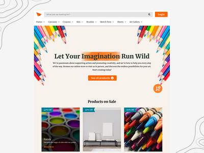
Art Supply Shop Homepage Design
An art supply shop needs to consider a wide range of colors in order to showcase the various art supplies offered. However, it is also important to avoid overloading the homepage with too many colors, as this can make it difficult for users to distinguish between essential elements such as the call-to-action buttons.
In my opinion, incorporating colorful art elements and images can help to create a visually appealing homepage while limiting the number of brand colors to two or three. This approach not only enhances the visual appeal of the website, but also ensures that the users can easily distinguish between the different elements on the homepage.
I would be happy to hear your feedback or suggestions on this matter.
More by Nikhil Singh View profile
Like

