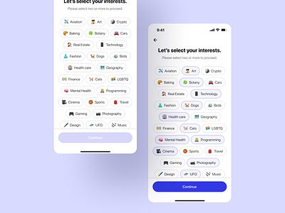
Onboarding Interest Selection Screen
I designed the Onboarding Interest Selection Screen as part of the Daily UI Challenge, drawing inspiration from Medium's Interest Selection Screen.
I incorporated relatable emojis for the interest tags. Unlike Medium's approach, which uses solid fill color for the selected state of the interest tag, causing visual conflict with the primary Call-To-Action (CTA) at the bottom, I chose to use an outline with subtle gray fill for the selected state.
This change was made to mitigate visual conflict and reduce the visual load.
Emojis are used from Emoji Mega Pack by Figma Themes from Figma Community.
More by Shyam Shrestha View profile
Like
