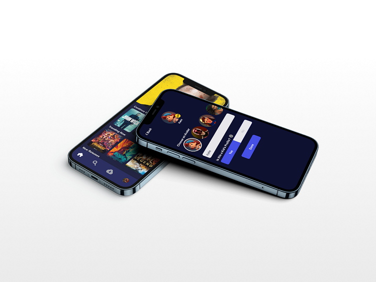
Streaming Service UI - Mobile App
Overview
This is a streaming service UI with influence from many other streaming platforms. The goal was to design an intuitive and fast was way for users to create a profile for their child, to guarantee only age appropriate content is viewable.
Project Goals
As mentioned, I needed to design a child profile feature but I needed to fulfill 3 requirements.
1: The process of creating the account needed to be completed in 6 actions
2: There must be a confirmation screen
3: There must be a visual difference between the interface for adults and children
Creating a User Flow
A lot of research had already been provided to me, and streaming platform UIs are fairly similar and have set the standard for functionality (some services withstanding). With that, I jumped into creating the user flow, taking general cues from my inspiration, and focusing on the most important information to keep the flow from becoming bloated. This info included a profile image, the name associated with the profile, and a yes or no section to signify whether the profile is for a child.
Wireframing
With a solid idea on the direction I wanted to go, I started to wireframe. My goal in the wireframe stage was to ultimately find a clear signifier for the kids profile and block out the process of creating the profile. I attempted many designs such as banners and using a dark color scheme for the adult profile and a light color scheme for the kids profile.
But I ultimately wanted to keep the signifier simple and out of the way. The user should be able to tell that the signifier is there, but not intrude on their experience.
But I ultimately wanted to keep the signifier simple and out of the way. The user should be able to tell that the signifier is there, but not intrude on their experience. So I decided on a small icon tag, attached to the child profile image. Sizing may need to be tweaked but it is a small, but clear distinction to help users know when they are using a child account.
Visual Design
Jumping into visual design, I wanted to practice utilizing color contrast guide to guide the eye, a skill I wasn't sure I had mastered yet. I focused my main colors down to Dark Blue, Purple, and White in various opacities. this helped me define the main interactions of the app using stark contrasting tones that would guide the users into specific interactions and provide information about where they are in the app.
For the Child Profile creation, I reorganized the user flow to layout in a more consistent way, compared to other streaming services. The Child Icon Tag would be a complementary, but still contrasting, yellow circle that says "Kids".
Included is also a clear notification that the profile was created, an a similar notification would appear if the profile is changed. Another detail is the removed content that the child account shouldn't have assess to. This includes, Account settings and a "help" interaction, that as seen in other apps, would take the user to the internet, where a child could find inappropriate content that this service obviously can't censor. Help should be obtained by the adult that manages the account.
Takeaways
I think overall, this project allowed me to focus more on a very specific and small problem in a wider industry that has, for the most part, designed their user flows optimally. Having this narrow focus, allowed me to practice skills I was unsure of and understand how and why professional designers have designed these services in this way. I think if I were to go back, I'd like to model my designs off of my least favorite streaming services to see if I could take my knowledge and understanding of the industry and apply it effectively, while maintaining the important aspects of the service.


