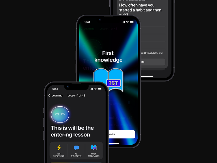
How to make article page more interesting, careful and memorable
I am currently in the process of creating a design for a sleep improvement app where the main factor in instilling the habit is a course of 42 articles that the user has to read and understand.
While creating the article page, I thought about how exactly the interface can engage the learning process and make it as pleasant and comfortable as possible.
Here are some of the techniques that I identified as appropriate for this task
Relaxing music
Since most users read articles in the evening, it is possible to enhance the effect of the reading and slowly prepare the user for sleep. For each article, relaxing music will be offered at the beginning, in this case immersing the user in a remote house somewhere in the mountains.
Comments
After going through the article, there may be some questions, so I've added a discussion option so that users don't feel alone and feel supported by the community.
Self-Reflection
At the end of the article, the user will find a small questionnaire with questions designed so that the user will reflect on the material covered, which will improve awareness and memorization of all the advice given in the article. After each answer, he will see how the community answered the same questions, all the same aimed at supporting the user, so as not to leave him alone with his problem.
Gamification
Depending on the situation, the app will reward the user for using the product in the form of rewards and achieves, this will increase the motivation of the user and continue to learn, track their sleep and come back to the app every day.


