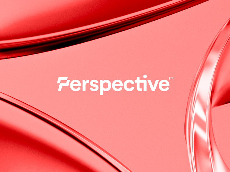
Perspective - Logo Redesign
Perspective is your own small team of designers & Webflow specialists. Packed in one easy-to-manage subscription.
Challenge
My main challenge was to come up with and design a solution as a wordmark, with the first letter P to be prominent to also work as a standalone mark. As one of their older logos embraced the 'interaction' symbol, I decided to find a new approach to this particular element. Incorporating it into the wordmark can work well in full-text usage or symbol standalone.
See their current (logo) here.
Currently open for feedback and if you saw a similar mark being done before close to this. Thanks in advance!
Thank you for your visit!
Want to work with me on your project?
Feel free to reach out via DM or email:
👉 info@jeroenvaneerden.nl
💼 Connect with me on LinkedIn / Read my Client Recommendations
🎬 Check my YouTube for Logo Tutorials / Learn Logo Design
🔗 Follow me on Instagram / See BTS and New Content
💬 Tweet with me


