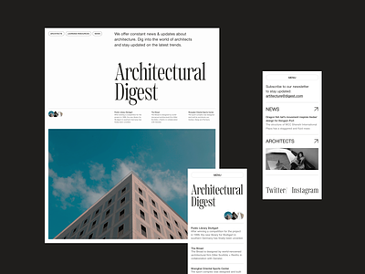
The Concept of an Architectural Website
This is a concept for a website about architecture - Architectural Digest. Initially, the idea came from my fellow designer, who worked on a cool animation with transitions between screens (animation coming soon in the next shot, so stay tuned!). And it was these photos of buildings with sharp corners that served best for the implementation.
The main focus, of course, was on visuals and typography. As the main one, I chose an accent font with sharp, characteristic serifs to emphasize the harsh, angular buildings in the visuals. Therefore, for the second font, for paragraphs, I chose the most neutral Helvetica Neue.
Also, I added a couple of screens of this concept for the mobile version of the site.
Don't forget to leave your thoughts in the comments and press 'L' if you like it.
P.S. I do not own the photo content. It belongs to the respected owners and is used only for visual purposes.
Website | Codepen | Behance | Twitter | Facebook | Instagram


