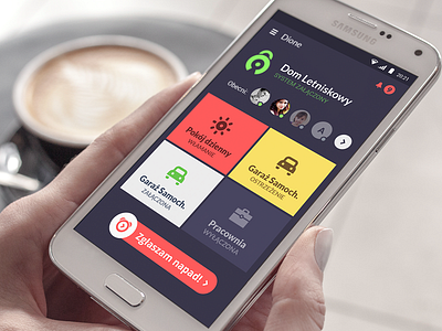
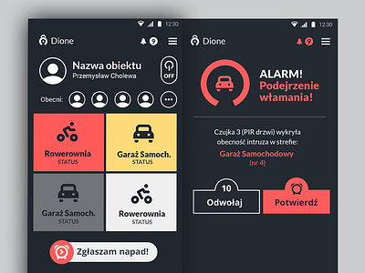
Dione App - Main Screan
Hello friends,
I've made some improvements both visual and functional into the main screen of the Dione mobile application . Let me know what do you think.
Basically through main screen view you can manage the areas of your home security system. Tab square area to activate/deactivate. User will also see burglary or warnings notifications in each area. You can see who is currently at home.
I remove big user image and place to the row of users, because it isn't that important. I added the icon app instead. I had to find better place to a system on/off switch. Is this clear to you? When you will click on logo you will turn each area off (whole system), and the icon will go gray.
I've change the color of the burglary activation button. I wanted to be more visible since user will usually see the white squares with green icons. Is this understandable to you, that if you hold on the icon and swipe in to right you will activate the alarm? That will help to avoid any random clicking especially by kids.
Thanks for any comments and insights.


