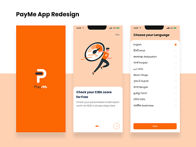
Payme App Redesign
A few days back, I was looking to do a case study on app Redesign, so I came up with an idea of redesigning the PayMe mobile application. While doing my process I came up with some changes, which are :-
#1 Splash Screen :- Splash screen color/theme does not match with the whole application
#2 Onboarding Screens :- There are no onboarding screens in recent app flow
#3 Language Screen :- Added regional languages, because in India people speak different languages in different regions
#4 Changed Email & Phone verification screens
#5 KYC flow :- In KYC there is no video record and a random number. As per this, there are chances of fraud in recent application
#6 Home Screen/Dashboard :- In Home screen added Outstanding Balance, Available Limit & Bottom Nav. So, that user will have full access to the application
#7 A few changes to UI
Figma Link :- https://lnkd.in/dbp-hnB7
Figjam Link :- https://lnkd.in/dd73XH8M
(Please share your feedback and views so that I can learn something new)
Thank You
