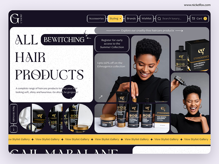
Haircare Product Website - Landing Page Design
Hello Dribbblers!😄
✨ Check out our 👉 YouTube channel 👈 for the latest design inspiration, tips, and tricks! ✨
Hey!
Check our new shot with a brand new layout design for a
Haircare Products Website.😍
--------------------------------------------------------------
Download the file link here
--------------------------------------------------------------
Have an idea? Let's talk here or WhatsApp
Follow us here:
🌸Your website is the face of your brand. That's why it's essential to make it look great, feel personal, and bring customers back time and time again.
📜This website design was created to serve as a comprehensive guide for anyone who wants to know more about haircare products.
💎It offers detailed product descriptions and reviews, as well as information about hairstyles, techniques, and maintenance characterized by a goofy UI layout.
Colors:
🖍️#171123 - Eerie Black was mainly used to set the dark-themed, aesthetic.
🖍️#FFCC4E - Maize to blend well with the base and regulate prominence.
🖍️#888890 - Philippine Gray to create depth and visual interest.
🖍️#FFFFFF - White to evoke the purity and simplicity that is this business.
Fonts:
GLAMORE belongs to a luxury, display serif font family. It is a perfect mix of modern with a touch of vintage.
GOTU is here to reinterpret what high-contrast Latin typefaces can be and its voluminous counters proved just the same.
Press 💖 if you like our design and share feedback!


