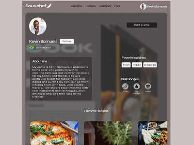
Profile for cooking website
Profile for a cooking website. I experimented with a modern look using low opacity layers. I enjoyed doing this one andI liked the results. I might go back to work on the spacing and typography. But overall I like it. What do you think?
More by Alfredo Cáceres View profile
Like
