Studio · Midjourney + Motion experiment
So I spent my weekend exploring midjourney to create some assets for noodle new Website. My first result was this one, a little 3d isometric studio
⛵️ Starting the journey
After watching a few videos about how to use midjorney I started to explore what it can do for me. I was amazed by the possibilities, so I created assets for our new website.
⌨️ The prompt
for this image I used " /imagine:isometric top view collage, grid, microphone, studio, retro, blue grid dark neon" and the result was this:
So the last result was the thing I was looking for. A little studio record, which I'll be using for the section in the site about how our product can help records and labels. The colors was a little off our brand identity, so a little bit of Photoshop, I adjusted the hue and saturation to have this result:
This expresses our brand a lot more. To give a little more perspective and depth, I created a grid for the floor and made the background a little lighter with a gradient blue, and added some noise.
Animating
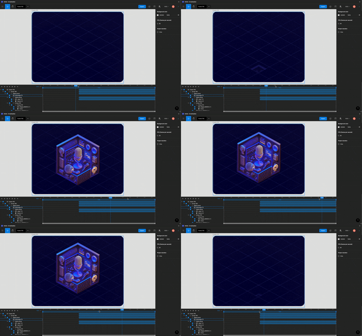
To use on the site, I decided to go with lottie. Light, scalable, and the webflow support helps a lot. Aninix, an amazing Figma plug-in was used to animate the scene.
To the web
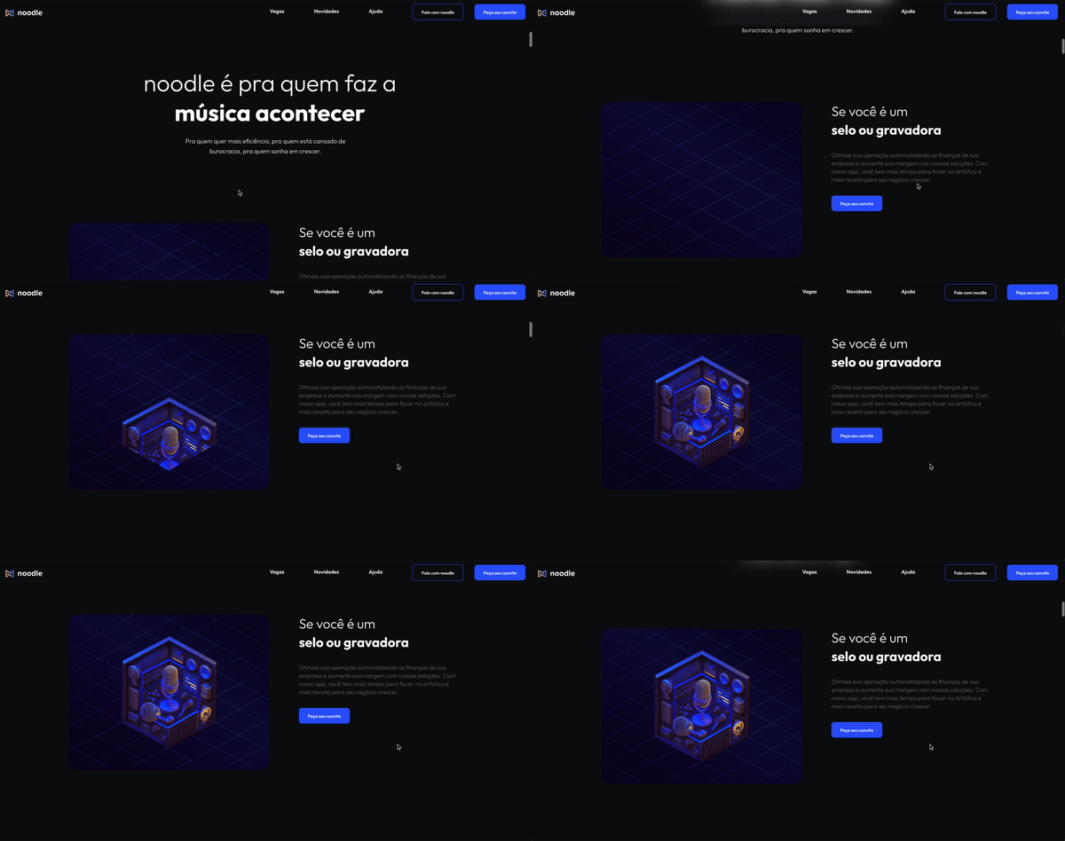
Our site is hosted based on webflow, so the Lottie integration is a drag-and-drop experience. I also used the scroll into view function to start the animation at the right time
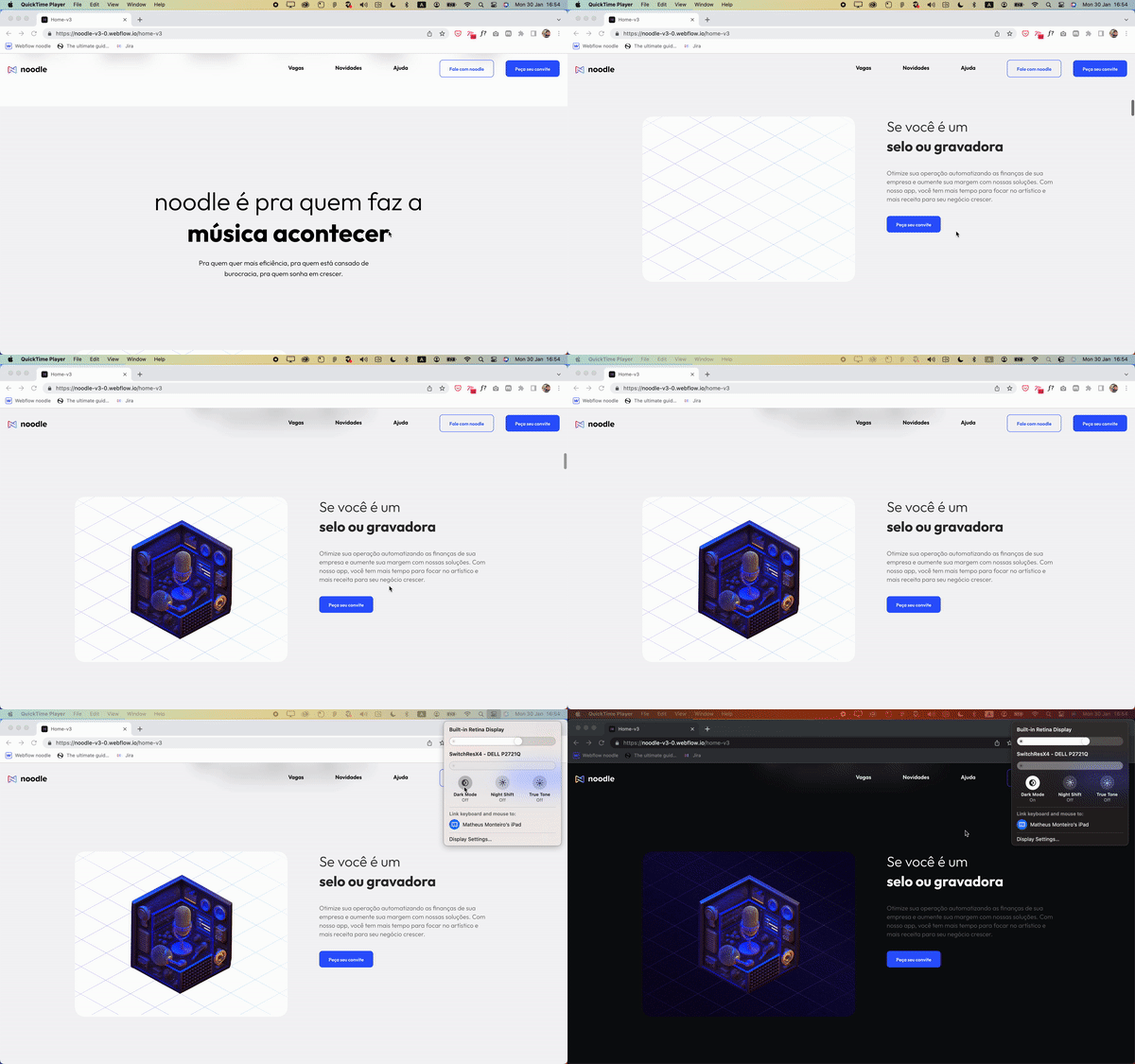
🌞 And when the lights are on
I used native CSS media queries to control light and dark modes on the site. The solution here was simple: remove the background from the Lottie file and have a transparent background. The wrapper has the right background color depending on the user system preference.
And that is the final result. I'll be exploring more midjourney and animations for the final version of the site, which is going to be live in a few days :)


