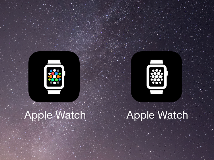
Apple Watch Companion App Icon
This afternoon I thought about why Apple chose the side view of the watch for the companion app on the iPhone and how it looked odd and not as nice as it could. I remembered a decent front view icon that Apple uses in the Health App. I traced it and added the icon field I drew earlier to make my vision of what the icon could look like, which I find easier to understand and easier on the eyes. Turns out, other people have been at this for a time now, so I'm adding this as a rebound.
More by Arno Richter View profile
Like

