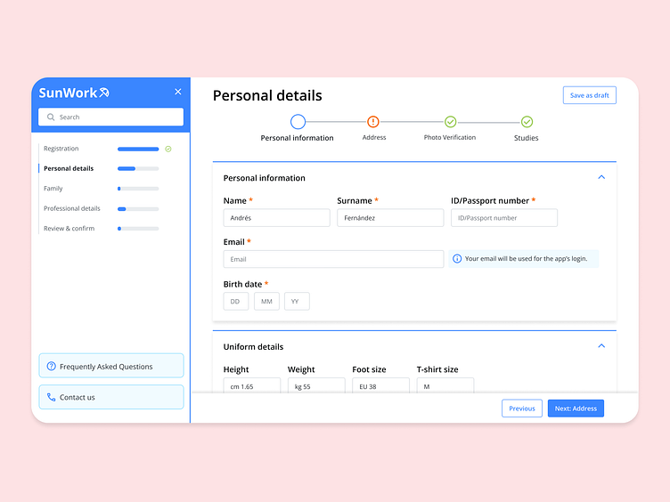
Multilayer onboarding form
Hello Applicants!
😧 Long forms can be dreadful. What if we could bring you closer to your next fun job in the sun? ☀️ What if we could guide your experience and make it easy to fill? 💪
In this use case, we worked on a solution for a long data collection form that had multiple layers and sections.
The three pillars of the design:
- Clear section structure.
- Show the user where they are and what needs doing.
- Easy navigation and jumping between sections.
This was the starting point for the design.
🚀 Our purpose is to make the applicant’s life easier when applying for their dream job in a sunny location! 😎 🏖
------
Show some love by pressing (L) 💙
Know more about OutSystems • Follow our Team
More by OutSystems View profile
Like


