Visual Identity Design for Nesha Learning School

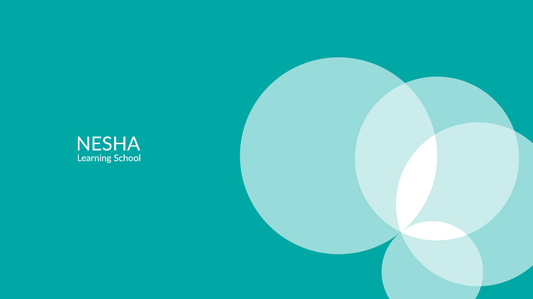
Visual identity design for NESHA Learning School | 2020 |
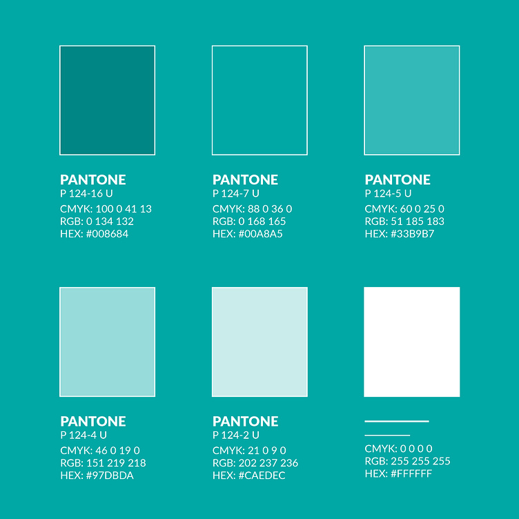
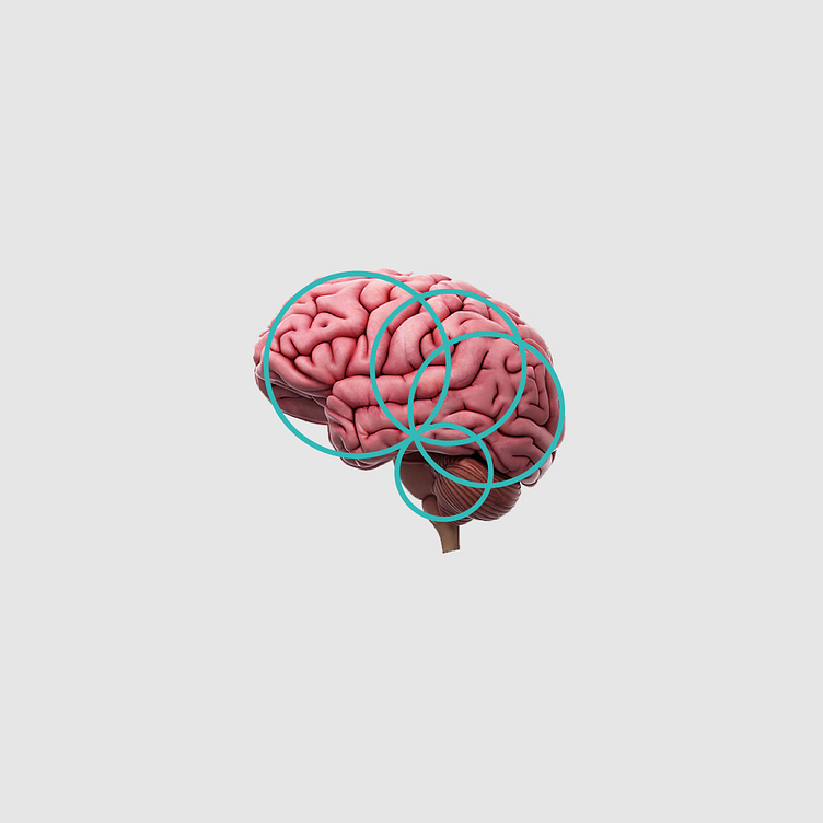
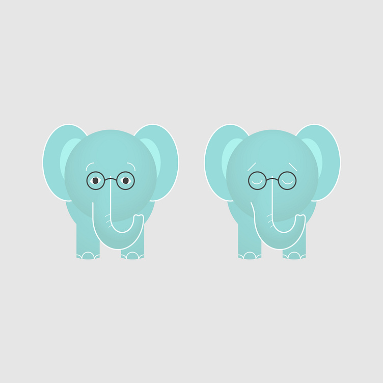
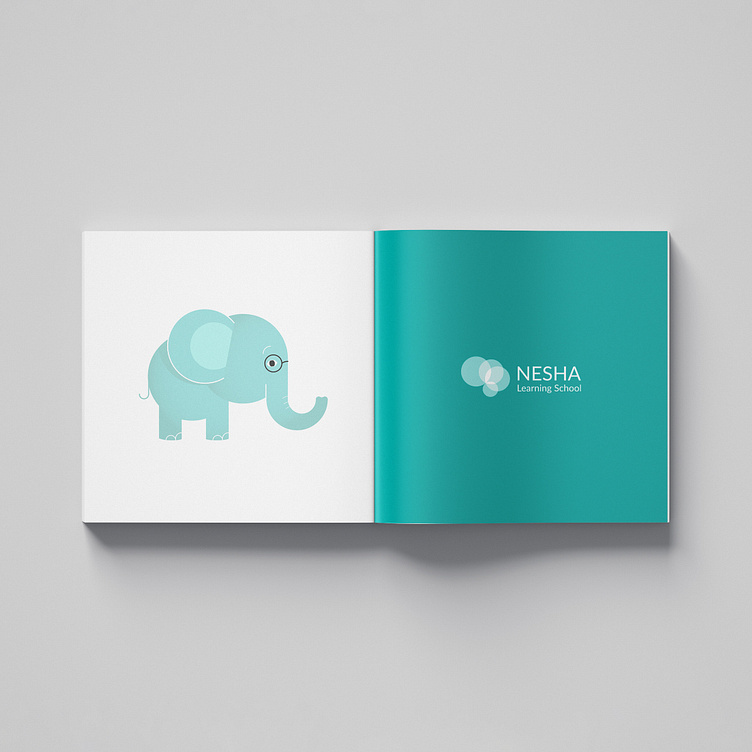
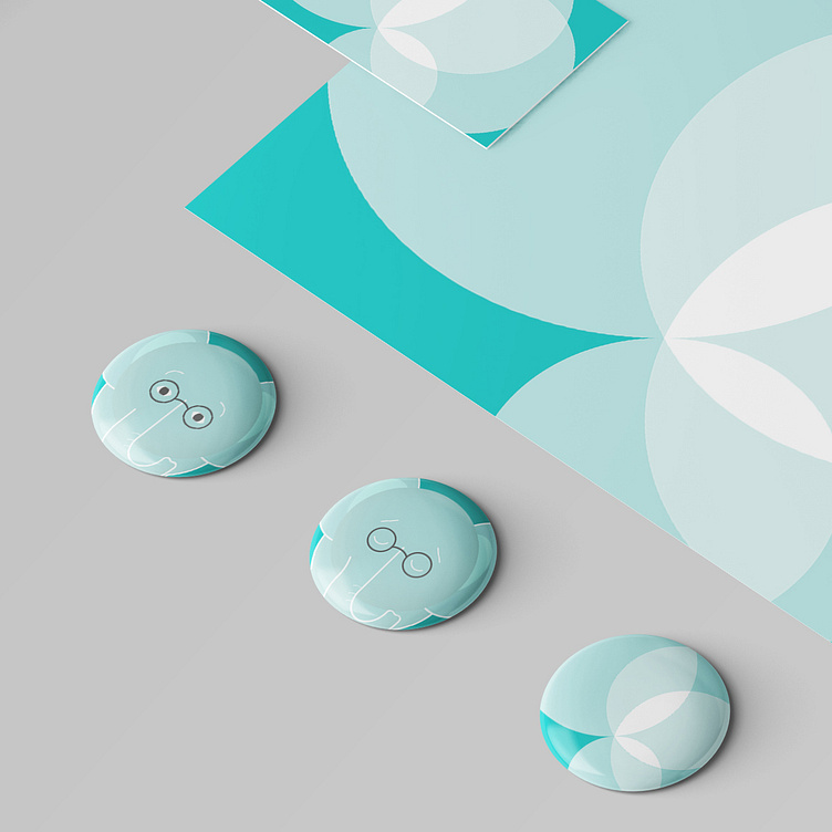
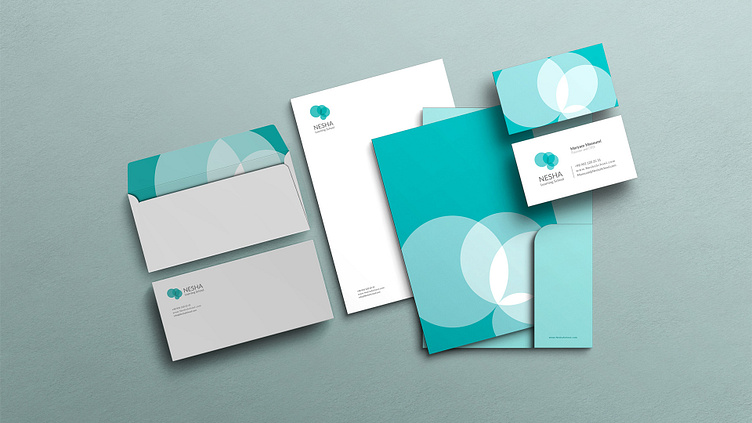
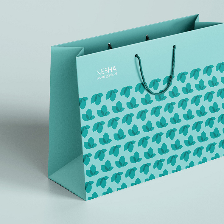
Nesha is a school for kids to learn financial skills. In their visual identity design, we used 6 different colors from white to green to show kid’s growth in the school. For the logo we inspired by human brain, as a symbol of knowledge. We designed an abstract shape of a brain with 4 circles. In this project a circle represents a systematic-thinking used in the school. The circles start from a little one to a big one to show the growth. We designed a consistent visual identity with logo’s circles. And also we designed an elephant as brand’s character inspired by their green circles to impress their kids.