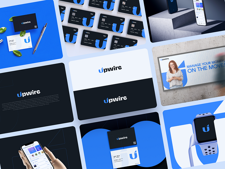
Upwire | Banking app Brand Identity Design
About
Upwire is an online mobile banking app that offers a convenient and secure way for users to manage their finances on the go. With Upwire, users can easily check their account balances, transfer money, pay bills, and deposit checks all from their smartphones. The app also provides real-time notifications and alerts to help users stay on top of their finances. Upwire uses state-of-the-art security features to protect user data and transactions. Its user-friendly interface makes it easy for anyone to navigate and manage their financial information. Upwire is the perfect solution for anyone looking for a simple and efficient way to manage their money.
The logo
The Upwire logo mark is a sleek and modern combination of geometric shapes that perfectly represents the forward-thinking and innovative nature of the company. The triangle symbolizes progress, ambition, and stability. The U shape is cleverly incorporated to represent the 'U' in Upwire and symbolizes unity and inclusiveness. The logo's simplicity makes it easy to recognize and remember, and it is strong enough to be used in various contexts. The combination of these shapes creates a dynamic and professional image that perfectly communicates Upwire's commitment to providing an innovative and efficient mobile banking experience. Overall, the logo is an excellent representation of the company, it is modern and unique, making it stand out in the market.
Challenges
Creating the Upwire logo may have presented challenges such as finding the right balance between simplicity and complexity, choosing the appropriate color scheme and typography, and ensuring that the logo is easily recognizable across different mediums. Additionally, combining the triangle and U shape to represent the company name and values in a unique and meaningful way could have also been a challenge.
Solutions
To overcome the challenges faced while creating the Upwire logo, thorough research and a good understanding of the company's mission, values, and target audience were done. This helped to define the direction of the logo design and make more informed decisions on the color scheme, typography, and shapes to use. Additionally, testing and getting feedback on different design options was done, and the design was iterated based on that feedback, which helped to ensure that the final logo was effective and easily recognizable across different mediums and applications.
Upwire | Banking app Brand Identity Design
.
⭐️⭐️⭐️⭐️⭐️
5-star rated agency on GrabStar
https://grabstar.io/profiles/ofspace/
.
🔥 We will provide a quick analysis and a free proposal for it. Don’t worry, it is secure and confidential.
.
✉️ Available for your long-term or short-term partnership 👋🏻 hello@ofspace.co
.
See How We Work At Ofspace


