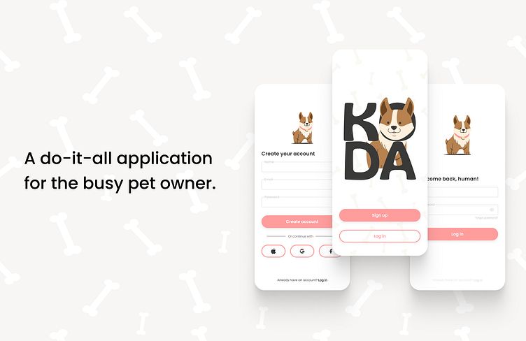
KODA: a dog-good mobile app
Hi there, human!
I'm Koda, a mobile application designed to provide my best care for your best friend.
The Problem
Pet owners find themselves struggling to find trusted and reliable caregivers for their pets. Finding digital pet care platforms that provide trusted, experienced, verified care providers is tricky at best. As millennials and gen-zers become the next generation of fur parenting, mobile applications aimed at providing care for these canine counterparts needs to be hyper-intuitive and ultra aesthetic.
The Solution
To solve this problem, create a digital platform for users to quickly and easily find pet care for their beloved animals. Eliminate the process of users having to self-research their care providers, while simultaneously creating a user friendly, digestible, and aesthetic mobile application.
My Role
My freelance client came to me in need of full product branding and high fidelity Figma designs that would be development ready.
The scope for this project was 20 weeks.
The design process I practiced included product branding, competitive analyses, user research, user personas, user flows, wire framing, mockup creation, and prototyping.
I primarily used Figma to craft this product. I also conducted user research via moderated interviews.
Product Branding
I was tasked with taking my client's vision and molding it into a product that would delight users at every click. My client defined their ideal user to me through these words:
Think millennial, coffee shop, Labrador, ice cream and clean lines
From there, I began to lay out some initial styling for the app.
Below is the mood board I created to help define the product prior to any UX/UI design. This helped both myself and my client make sure we were on the same page regarding where the app’s “look” and "vibe" was heading.
User Research and Competitive Analyses
Throughout my research process I conducted in-person interviews with a variety of potential users from the young urban professional to the middle aged single mom. In my interviews, I found that 100% of participants would use a pet care service. I also found that a trusted caregiver was the most desired quality from all interview participants. Participants also stated they would appreciate a platform that provided a variety of services such as drop in visits, overnight stays, grooming, and veterinarian resources.
In addition, I performed a handful of competitive analyses of other pet care services found online. As my task was to design a mobile app, I chose to audit the current most popular mobile apps available in the app store. These apps included WAG, Rover and Care.com. Usually, when conducting competitive analyses, I will download the app to my own phone and screenshot the UX flows involved in signing up, onboarding, and engaging with different features. Throughout this testing, I take notes and comment my likes, dislikes and ideas to later refer to when defining my products' features and functions.
User Personas
From my user interviews and market research, including my competitive analysis, I crafted a general persona for Koda's ideal user. Meet them below:
User Flow
Drawing upon these personas and user-centric designs practices, I defined key user flows that a Koda customer would encounter within the app.
Koda would beat the competition with a low barrier to entry and high interactivity with special features like viewing your dog’s live walk on a map by way of the caregiver's phone GPS.
This way, Koda users can truly trust that their dog is getting the walk they paid for and on the route they feel safe with.
Below is an example of one of the multiple user flows I created for Koda. This flow demonstrates the easy-to-use onboarding and service booking features that Koda offers.
Wireframes
Based on my previous user research and creation of a general user flow, it was time to start wireframing. My client wanted a very aesthetically pleasing app that would appeal to millennials and gen-zers. When designing wireframes, I focused on using screen real estate for well sized cards, calming white space and clear visuals so that Koda would feel simply modern and easy to engage with. The examples of low fidelity wireframes shown below were used primarily to define key features and communicate them accurately to my client.
High Fidelity Mockups
Beyond my low-fi wireframes, I was able to confidently approach creating mid and high-fi designs. I like to use lower fidelity wireframes to define features and basic layout while brainstorming without investing unnecessary time and energy into the user interface, as the exact UI is typically determined later in the design process. I considered these designs the "V1" UI for Koda, as I began to integrate some styling with colors, buttons and imagery.
Takeaways & Next Steps
In designing Koda, I learned a lot about the importance of utilizing user research and different fidelity levels of wireframes to define features and communicate clearly with clients. My clients had some ideas going into this about what the product should contain that my user-centric design instinct didn't necessarily agree with. When I conducted user research, I was able to explain to them
through solid data findings why these features were not as helpful as they had assumed. This saved my client time and financial investment in the design of the product and ultimately created a more enjoyable and relevant product that will boost Koda's success against it's competitiors.
My designs had a major impact on this budding company as I was able to involve my client in the entire design process, allowing Koda to stay true to the clients original vision while also evolving to delight the ideal user base across every feature. As my contract came to an end, I was both pleased to have provided my client with a development ready high fidelity design as well as excited to (one day soon) see Koda live in the app store.


