Project Management Data Visualization

Data Visualization Design
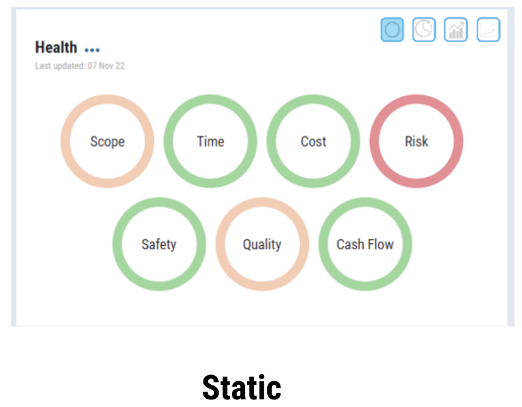
The charts that need to be designed would be a continuation to the static chart below, showing a color coded status of what the situation is for each category.
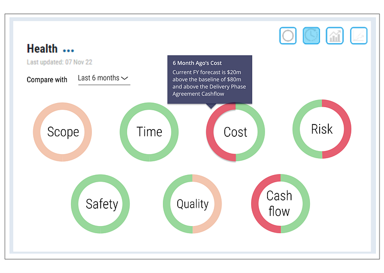
Period Comparison
Design Brief
After seeing the current situation the user might ask "What changed since last month?"
Design Result
For the chart I decided to keep the circular shape, keeping the theme with the static data view. It keeps the familiar form to keep the learning curve small.
Chart is read from left to right, left as past data, right as current data, like reading a time chart where it's mostly from left to right.
When there is no change in status, color remains the same to quickly signify no changes.
Dropdown for user to be able to choose what to compare the present status to (last month, last quarter, last year, etc.)
When hovering over a part of the circle the descriptive data appears; A similar behavior with the static chart.
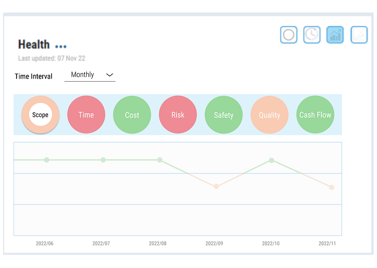
Trend Chart
Design Brief
"After several periods of change, what is the trend over time?"
Design Result
Because the data is based on color, I divided the line chart y axis into “color zones”. The color zones are represented as the color of the line, which will change signifying a change of status during each time. It’s natural for people to think higher is better, so green goes on top, amber in the middle and red at the bottom
To avoid cluttering the chart, the user can select which item they want to be displayed from the top bar. The top bar shows the current status of each data. The user can refer to this or it may act as a trigger/reminder on which item they want to analyze in this chart.
Same as in the previous section, there is a dropdown to select the time interval for the data shown in the chart. Also same as in the previous section, on hover the description during that time will be displayed in a tooltip.
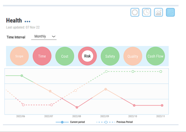
Benchmark
Question to Answer
"How am I going versus historical data and what do I need to do to course correct?"
Design Result
This part keeps the design of the “trend” section, but adds a fainter dotted line to show previous month/quarter/year then the actual data in solid color which is what their current progress is.
Benchmark and trend are in a similar design to make it more uniform and reduce the surprises for the user.
Same as in the previous sections, there is a dropdown to select the time interval for the data shown in the chart. Same as in the previous sections, on hover the description during that time will be displayed in a tooltip.
