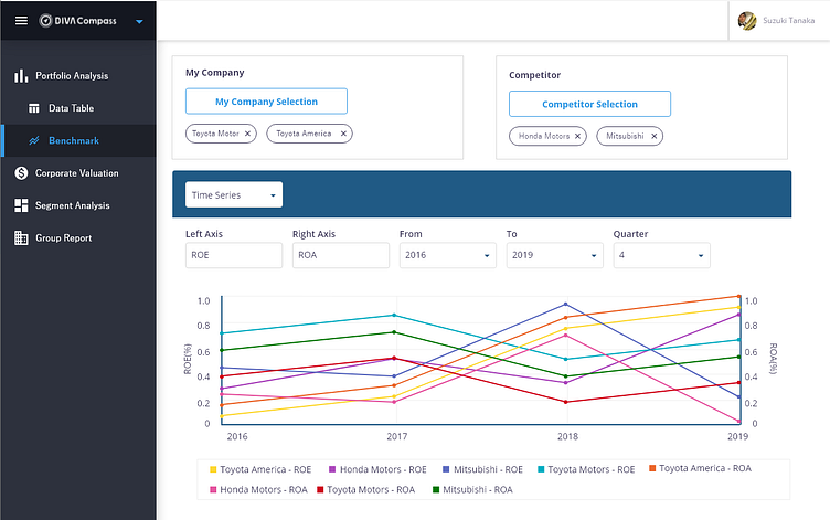
Benchmark
Ideation
The product owner came with the idea from one of our users and asked to create this new feature where our users can compare their corporate financial data with the data of their competitors.
I started the discussions with all the related stakeholders to define the user story and set boundaries of what the necessary requirements from them were.
Research
To understand the needs and preferences of the target user group, we conducted user interviews and surveys with employees from a range of job roles. We also analyzed the existing benchmarking tools available in the market to identify common design patterns and best practices. Our research showed that employees preferred a simple and straightforward interface, with clear instructions and guidance.
Prototyping
Mid Fidelity Prototype
Based on the insights from our research, we designed a clean and minimalistic interface, with a focus on ease of use and accessibility.
This resulted in 2 mid fidelity prototypes that I presented to stakeholders, along with pros and cons for each design.
High Fidelity Prototype
I created a high fidelity prototype based on the design they selected.
Our design solution evolved over time, based on feedback from user testing and stakeholder meetings.
I completed all the possible screens/features down to all the possible little interactions.
Impact
The Benchmark feature was well received by our users, who appreciated the ease of use and the ability to benchmark their corporate performance against their competitors. Our users have mentioned how much they appreciate how we listened and how fast we were able to accommodate their needs. Additionally, the insights generated by the application have helped companies identify areas for improvement and prioritize their company's goals for the next 5 - 10 years.


