Landing Page Design: Web Site UI Minimalist Website
Hello Dribbblers👋!
✨Check out our 👉 YouTube channel 👈 for the latest design inspiration and tips& tricks!
Introducing our new minimalist website design for skincare 🧴 brand "Minimalist Website"!
--------------------------------------------------------------
Download file link here
--------------------------------------------------------------
Have an idea? Let's talk here or WhatsApp
Follow us here:
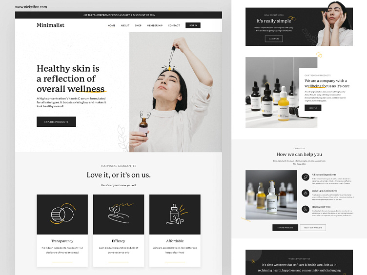
Our design focuses on clean lines and a minimal color palette to showcase the natural beauty of our products. The layout is simple and easy to navigate, allowing customers to find the perfect skincare solution with ease. The hero image prominently features our best-selling products, while the clean typography ensures easy readability. The use of white space highlights the simplicity and purity of our brand. We believe in the power of minimalism and our design reflects that philosophy. Give our website a try and experience the benefits of our natural, minimalist skincare.
✨This minimalist website design showcases a monochromatic color scheme, primarily using shades of gray and black.
✨The background is a light gray color, while the text and icons are in black. The button on the right side of the design has a red color that stands out and catches the attention of the viewer.
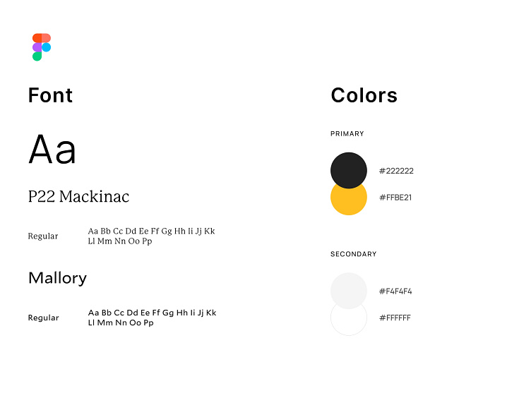
✨The font used in this design is a clean and modern sans-serif typeface. The text is easy to read and the font gives a professional and sophisticated look to the website.
Overall, the color scheme and typography choices in this design work together to create a simple, elegant and sophisticated look.
Press 💖 if you like our design and share feedback!
Interface by Anima Agrawal
Motion by Akanksha Verma