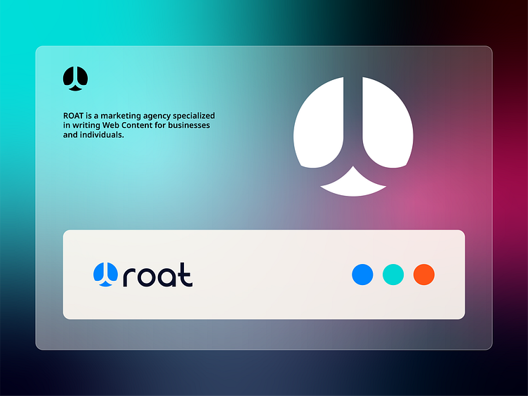
Roat _ Logo Design
This is a logo design project for Roat, where the client is very passionate and involved in his project.
He was initially skeptical about the proposed concepts, but after extensive research, a solution that worked for him was found.
Concept 〽️
The final concept is an image of a tree formed by two lowercase letters "R" that are turned upside down and back to back to represent a tree with roots.
Client feedback🎊
The client was satisfied because he felt that the design reflected the values and history of his company.
Have a lovely day everyone and would love to hear your thoughts on this concept.
Anzeez,
___________________________________________________________________________________
Let's work together and elevate your brand
Feel free to reach out via Dribbble DM or E-mail:
🔗 Follow me on Instagram / See BTS and New Content
💼 Connect with me on LinkedIn
