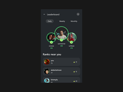
DailyUI #019 - Leaderboard
Brace yourselves, folks. Another dark mode screen for my carpooling app is on the horizon. This time, it's a leaderboard. Just when you thought it couldn't get any darker... 🌙
Design Hint 💻
Design a leaderboard. Is it for gaming, sports, politics, or something else? Consider the important statistics to show, percentages, points, profile pictures, etc.
The Idea 💡
Maximizing what I have, I'm excited to continue promoting carpooling through this app. Not only does it reduce traffic and emissions, but users can earn points and rewards for participating, all for a small fee. Does this make sense? Let's see!
Final Thoughts 🧠
While this screen may not be my favorite, it's the best iteration I could come up with. It may lack a certain design flair and feel a bit empty, but I wanted to steer clear of copying others' ideas. In the grand scheme of things, it serves its purpose.
Share the love, press "L" or "F" if you ❤️ my work!
Want to see my latest creations? Head over to my profile and hit that follow button. 🎨
