Powens - Brand Guidelines
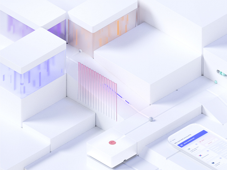
One of the major elements of Powens' new branding is these 3D scenes. We made the choice of using 3D in order to give us a great flexibility in the stories told in every visuals.
It also allowed us to play with different materials, especially glass which takes an important place in our 3D scenes. On one hand, it gives a sense of transparency, and on the other hand, we wanted to convey the idea of privacy by blurring the glass off. These elements were two major aspects that Powens' team wanted to bring into this new brand identity.
The goal of this product overview was to illustrate how every Powens' products are different but can also work together as one. You can see in this post some draft that we've made. As you can imagine, this idea of a path, of something that is guided, was much easier and more catchy with 3D illustrations in an isometric view.
After a few iterations, we stopped on this version(1) where each product is represented in seamless loop animation.
Check out the Web site online https://www.powens.com/fr/
Show some love! Press "L" if you like the shot!
---
📪 We are a design studio for startups! Have a challenging project? hello@pelostud.io
🗂 Our Website 🌟
📸 Feel free to Check Our Instagram


