PrioRe Web
Simplicity and Modernity in Reinsurance: A UI/UX Design Case Study
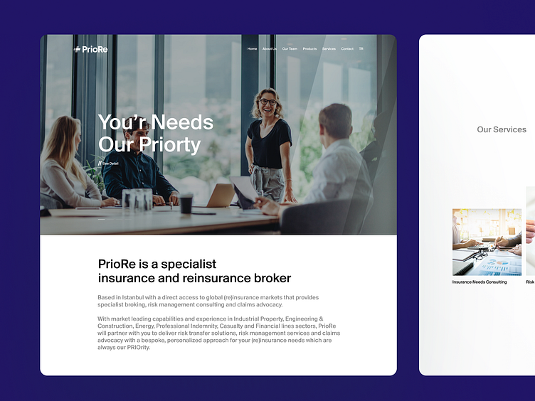
I recently designed a UI/UX for a reinsurance company, with a focus on simplicity and modernity. The research on the target audience and their needs was crucial in creating a clean, minimal and user-friendly interface. The final design aims to make it easy for customers to navigate and access their insurance information.
The design also incorporated elements of minimalism to convey a sense of trust and professionalism, which aligns with the company's values. The color palette was kept simple and neutral, with the use of white space to create a sense of openness and clarity. Additionally, the typography was chosen for its legibility and simplicity, making it easy for customers to read and understand their insurance information.
More by Halil Yaşar View profile
Like


