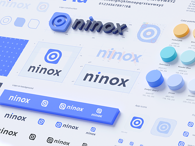
Ninox Branding, visual identity, corporate brand design
This shot for Ninox is relatively close to the previous illustrative guide. It is sort of a rebound, where we demonstrate how complex illustrations are working with people.
During the creation of an illustrative style, there are a few things we take into consideration. First, that it has to radiate with the brand character and any user can actually describe it. Second, all of the elements have to be consistent and homogeneous. Also, each element must have its own function, not a random object attached to it. For example, the dotted line symbolizes the development path, the bold dots are the accomplishments, and so on.
It's important to have each illustration represent as a modular block, which you can use to build absolutely new ones.
More by Ramotion View profile
Services by Ramotion
Like

