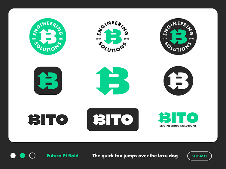
Engineering Firm Logo Design
I crafted a bold and solid lettermark based on the initial letter of the brand name and then included it into some type, resulting in a simple and functional wordmark.
The logo expresses movement with the help of the up and down arrows, suggesting a constant expansion towards reaching new and challenging heights.
Along with the logo and wordmark, I designed other supporting symbols such as badges that also can work as stickers.
Projects 📩
mihaidolganiuc@gmail.com
Let's Connect 👋
All images, artworks in this post are not to be used or distributed without the consent of the designer.
© Mihai Dolganiuc Design 2023. All rights reserved.
More by Mihai Dolganiuc View profile
Services by Mihai Dolganiuc
Like


