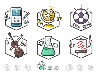
DonorsChoose.org Badges
Finally getting a chance to post some work I've been finishing up the past few months. Been a busy bee!
Here's part of a really fun project I worked on with Dan Betz of DonorsChoose
More about it on my updated portfolio (now finished with new branding / logos / about pages / etc)
Brief
This project was a bit more than just some icons for a website. We wanted these to become part of the brand very quickly. Something highly scalable up and down and good for full detail and one color stuff. These icons will be used all around the site to help indicate what category any particular donation or entry is.
Detail
We came up with something of a design pattern for these and its pretty obvious but basically keeping them one primary color each, with a primary object that is very indicative of the majority of the category, backed up by two smaller secondary elements that helped branch the category into the outer corners of the category.
For example, with 'health and fitness' - most projects / pages are about sports (helping kids get the proper equipment to learn / play sports. But of course in that is also funding for proper healthy lunches, or proper fitness training.
See the rest of them over here
http://trzown.me/donorschoose-badges/

