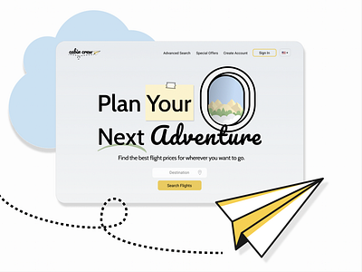
#DailyUI Day 3: Landing Page.
I love to travel and am always looking for flight deals and vacation destinations. So, for today's landing page, I decided to use "Search Flights" as my CTA. I kept it simple and streamlined with fairly muted colors so that the bright yellow button stands out and draws users to it.
(Paper plane and mountain illustration by Icons8.)
More by Alyssa Hennessey View profile
Like
