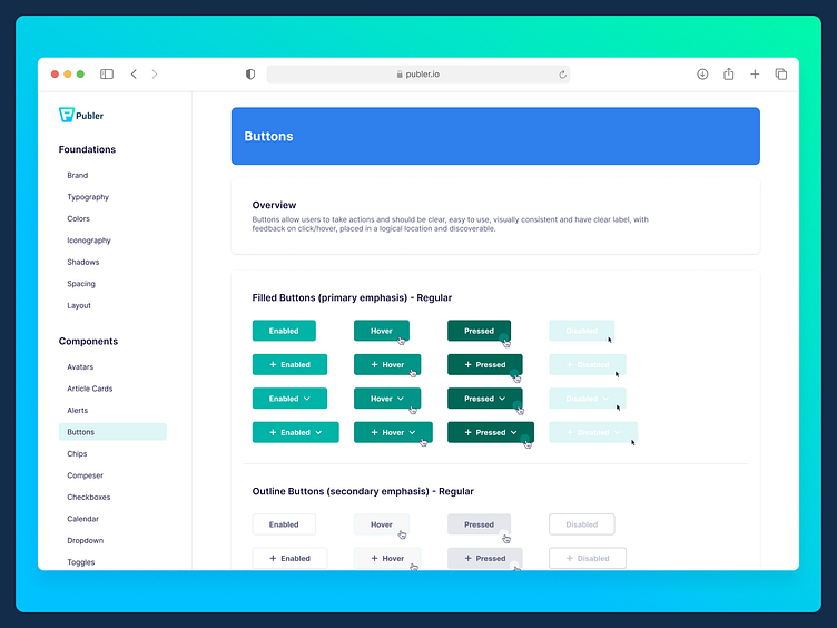
Buttons at Publer Design System
When placing buttons on a webpage, it is important to clearly communicate to the user what will occur when the button is clicked. These buttons, also known as call-to-action (CTA), should have concise, action-oriented labels with precise language and avoid technical jargon.
To make buttons stand out, use a contrasting background color. Capitalization style can also convey tone to the user and elicit an emotional response.
It is important to keep font size consistent with body text, typically between 16-18px, to avoid overwhelming the user.
Buttons should have a realistic appearance and include padding. Additionally, adding hover and focus effects, such as a darker background color or outline, can enhance interactivity and accessibility.
𝘚𝘤𝘳𝘦𝘦𝘯𝘴𝘩𝘰𝘵 𝘧𝘳𝘰𝘮 𝘗𝘶𝘣𝘭𝘦𝘳 𝘋𝘦𝘴𝘪𝘨𝘯 𝘚𝘺𝘴𝘵𝘦𝘮
