Bisected Home Page
UX and usability experts: I’m looking for some help.
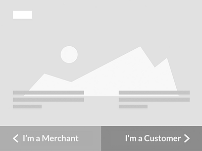
1. What would you call this UI pattern?
It’s been so long since I’ve seen anyone use this method in a design, or refer to it in a usability post, I can't remember what the pattern’s called! It’s something like “bisected home page” or “landing page doors” or something, but I can’t really find anything when I Google variations of those.
2. Is there any recent data about such a UX?
I recall that this pattern was frowned on for a long time, and I recall some of the reasons. But I’m wondering if anyone has any more recent data.
One of the reasons this UX was bad was that your site takes a huge SEO hit if you just have a blurb or two and then send them off to another page. Little or no SEO value on that home page. (FWIW, I wouldn’t do that here — we’d load the reset of the page below the “fold” seen here, with all the SEO goodness intact. The buttons would animate/scroll the page up to reveal the correct “side.”)
3. Know of anyone doing this pattern well?
I’d love to see it. Hit me up with links in the comments!
Thanks!
Of course, I’ll follow up with a rebound of the design if we try this path.