7th Ave Website Design
When it’s time to introduce your product to the world, you want to do it right. Which is what we did in designing the 7th Ave website.
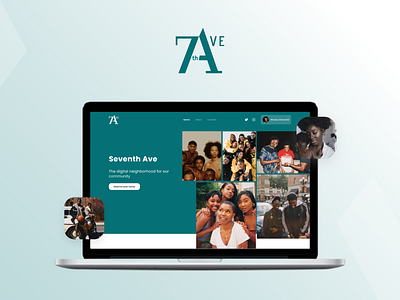
We designed the website to position 7th Ave is a community that brings people together though social and audio. This meant becoming more than just another app.
One of the challenges we had to address was the balance between the product and the people. How we highlighted the technology and features with the authentic human connection that they aspired to create.
We did this through three themes: community, collages, and color.
The idea was to create a mosaic of diverse puzzle pieces that came together to create the Ave.
We curated a library of imagery that highlights the richness and diversity of the community. The way the elements of the website are composed within the canvas is inspired by the idea of a moldboard or scrapbook. This presents the Ave as a place where you come to find inspiration as well as somewhere you make memories with your friends and family.
The colored background blocks speak to the vibrance and warmth of the brand and allows us to seamlessly blend the UI with ambient background elements.
The final touch was the animation design on the site. We wanted these to feel fresh and dynamic without being too childish or distracting. The animation and transitions helped bring everything to life and make the website stand out visually.
To read more on this product, kindly go to www.blacklotus.co to view the full case study.
Feel free to give us your feedback.
And don't forget to press "L" if you love it.
We have more designs coming soon😊!
----------------
We are available for work:
📩Email Us : hello@blacklotus.co
😎Instagram : blacklotusventures

