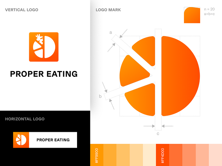
PROPER EATING: Company Logo, Brand Guidelines, StyleGuide
Proper Eating is a handy app for losing weight and maintaining adequate nutrition. The main idea is that proper eating is essential to a healthy lifestyle. The app helps you eat properly by providing recipes and tips on good nutrition. It also has a calorie counter and allows users to track their weight loss as they go along.
We designed the logo, icons, and brand style for this app.
After analysis of competitors color palette, decision was made on colors for future brand. They are associated with food and energy.
Next step was research and creation of graphical element and it's uniqueness, readability and memorability. Graphical element was made easy and universal. There are several variants of logo, which allows to use it in different context in the most favorable light.
We made sure the logo was visible in low-contrast backgrounds so it would be easy to see on social media posts or when someone sends it in an email; we also made sure it would be comfortable and intuitive to use. We designed the Instagram banner grid in potentially recognizable colors of the app. In this way, the design reflects the app's essence in a harmonious way - to make users healthy and slim.
That and many other guidelines are stated within Brandbook.
Design by Maria Bohatyrova
Want to see more of our designs? Check them up here
Press “L” and save it for later inspirations 💚


