Swift Logic

Logo Anatomy
Swift Logic is a concept work for a logistics and technology company. They are specialized in industrial deliveries in Europe.
The logo consists of 3 driving signal waves and the word mark Swift Logic. The typography has beveled corners, which are incorporated into the figurative mark.
The spacing outside and inside the logo is super precise and is derived from elements of the figurative mark.

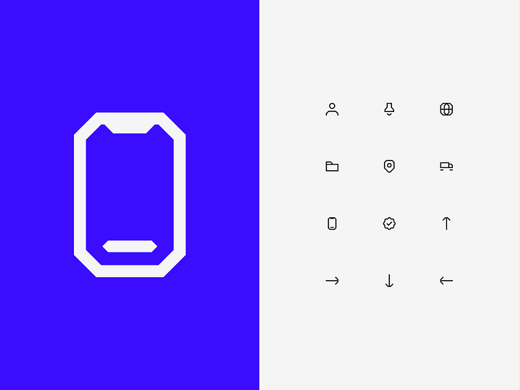
Iconography
The characterful design of the figurative mark is also reflected in the icons used.
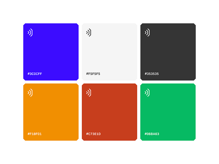
Colors
The corporate design of the logistics company is characterized by a clear color palette. The primary color, also known as the highlight color, is a deep and powerful ultramarine blue. This color gives our image a serious and professional look. The background color is a light gray, called "fire engine gray". This color ensures that the text and other important content is easy to read.
The text color is a classic "slate gray" which provides a good contrast with the background.
Our secondary colors are a bright "orange-yellow", a "copper-red" and a fresh "moss-green". These colors add a modern and dynamic touch to our look. They are used, for example, in graphics and diagrams to highlight specific information.
App icon

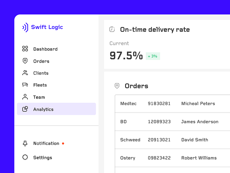
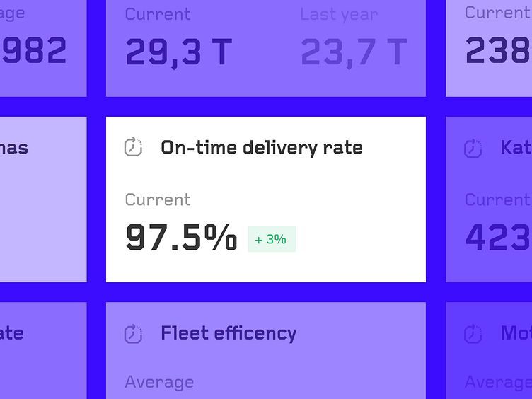
Logistic management system
The Logistics Management System dashboard provides user-friendly navigation on the right-hand side, allowing you to quickly switch between different areas such as orders, customers, fleets, team, analysis, notifications and settings. The main area of the dashboard provides key information such as delivery time, fleet utilization and customer satisfaction at a glance. This information is presented in the form of percentages or other indicators, allowing a quick check of the current status. A list of current orders is also visible, providing an overview of current orders.

If you see something inspiring for your next project, drop me a line at hello@metzograf.de ✌️