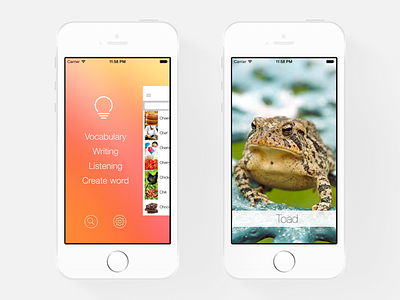
iLearn: English - Menu
iLearn: English - Menu
The first version of iLearn, the menu had too many things, being polluted and confuse.
I decided to clean this screen up, removing all the unnecessary elements, showing only the items that were extremely important for the user. Cutting the extra fat of it helped to reduce the cognitive complexity of using the app's menu, making simpler to understand and use.
Site: http://www.ilearnenglishapp.com/
iTunes: https://itunes.apple.com/app/ilearn-english/id624466757
More by Danielle Vicosa View profile
Like
