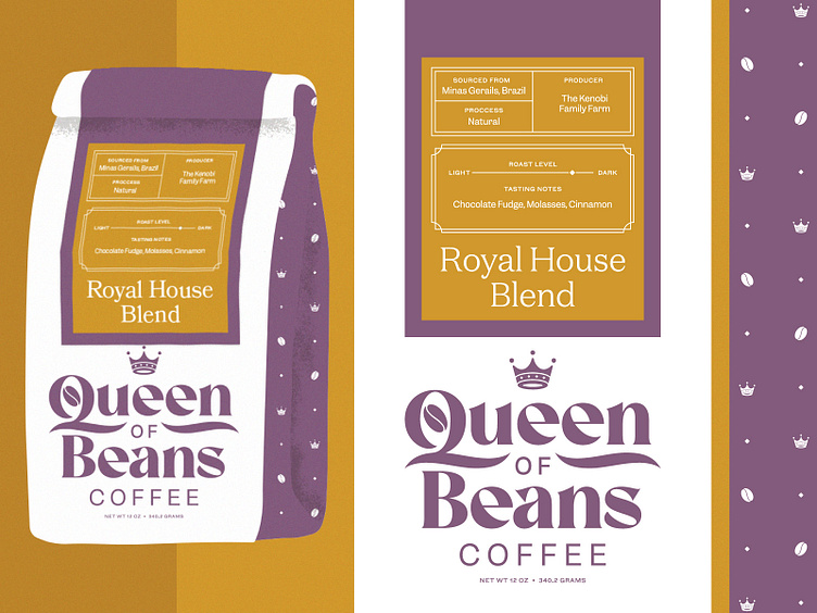
Unused Direction: Queen of Beans Coffee Branding
Hey dribbbaddies,
Here’s a branding direction that wound up on the cutting room floor. In the end there was a slight disconnect in tone — while Queen of Beans is friendly and relatable, meant to convey quality and—to state the obvious—regalness (regality? regaliciousness?). So that was the line we were trying to walk.
I’ll be excited to share the chosen direction in due course, but for now hope you like this outtake. I sure do.
.
.
.
Hi, I’m Brent. I run a graphic design and branding studio here on planet earth. I help artists, small businesses, and humans of all stripes make their ideas real and real beautiful.
More by Brent McCormick View profile
Like
