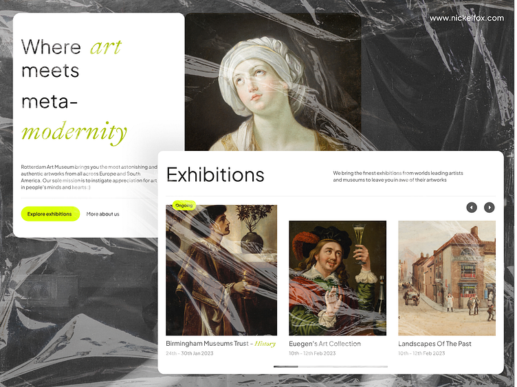
Art Museum- Landing Page Design
Hello Dribbblers👋!
✨Check out our 👉 YouTube channel 👈 for the latest design inspiration and tips& tricks!
This design brings to life a Modern Art Museum- which values contemporary design but has a minimal modernistic approach at its heart. The design is very modern and snapped to the grid, using it to create a cleaner design. The accent color is very pop and the typography is very chic.
--------------------------------------------------------------
Download the file link here
--------------------------------------------------------------
Have an idea? Let's talk here or WhatsApp
Follow us here:
--------------------------------------------------------------
Here are the specifics:
Colors -
Good O'l White - #FFFFFF(Used as Bg)
Not Black- #212121(Used as a BG )
I am Grey- #5A5A5A(Used as subtext and other details)
Different Green- #ACC300(Used as accent and heading)
Neon Green- #DBFF00(Used as sub accent colors)
Fonts -
Plus Jakarta Sans |Regular, Medium, Bold | Used for Headings, Body Text, and Accents
Asset Link or credits
Figma and Unsplash(Birmingham Museum Trust) 🙌🏼
You can explore our work here -
Cosmetics E-commerce Web Platform
Restaurant App - Landing Page Web concept
Don't forget to press "<3" and comment.
Thanks :)


