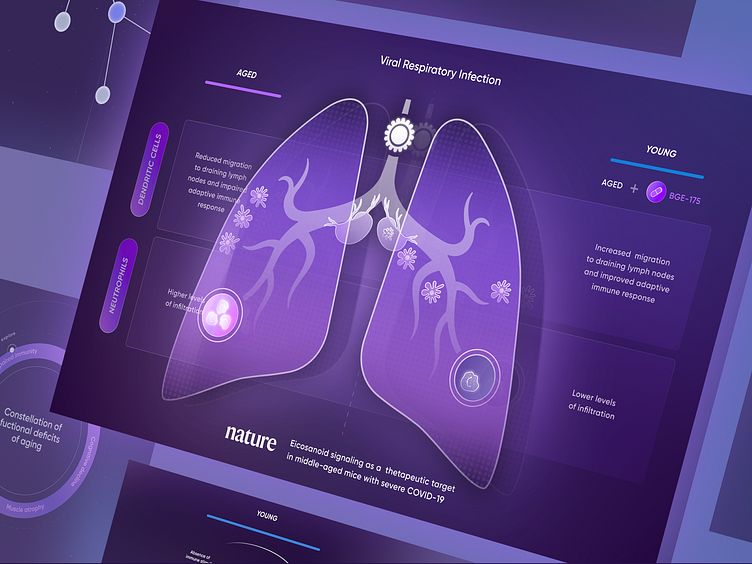
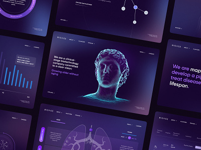
The Illustration in Interface of the Biotech Startup Website
Enter your text here...My turn to continue to unveil the process details of the BioAge project. Make sure to check it out on Behance.
The biotech website interface was purposefully designed to be user-friendly, straightforward, and easy to navigate for the target audience. The main accent was put on striking images for a user to clearly visualize the process of the mechanism-agnostic approach of the company.
But at the same time, it's crucial to keep it easy on the eyes with a color scheme and typography to be consistent.
It was essential to implement clear icons and labels for each field.
For each icon, the customer gave a reference with a description so that in the future I could draw them in the style of the project. The most challenging illustration to draw was a man with a telescope. A very large number of particles that fly around it, and the client's request was to add more of those to enhance the illustration.
Shout out to my partner in crime for helping me out with the shot.
The visuals were made in Figma.
Don't forget to leave your thoughts in the comments and press 'L' if you like it.
Website | Codepen | Behance | Twitter | Facebook | Instagram


