Wellest Branding, visual identity, corporate brand design
💎 Get inspired: branding projects
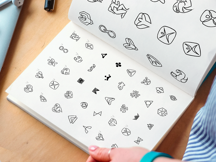
The way we create logos for Wellest is pretty different from the "industry standards." Most designers create a few rough sketches to highlight an idea for themselves and then build from one to three options of the HQ rendered vector logo to present to the client. Maybe that works but not for us.
We believe that the sketching phase is an essential part of the logo design process. Here are three reasons why:
1) We want to make sure we choose the best direction, not the first one we like the most. Regardless of your professional level, there is always a chance that you'll love a particular option. At that moment you truly believe that's the "magic pill" for the brand, that's a genius idea for the logo. We do our best to fight this feeling because it is very subjective. The best we can do is to keep exploring dozens of low fidelity shapes to be able to say: "Well, we visualized almost all the ideas we had in mind and yes, that's the best one."
2) We want our clients to understand the whole creative process and let them become co-creators of the brand identities. Knowing that empower them and the teams to tell consistent and robust stories of the brands; They understand the reasons why we made this or that decision and can ensure that it was the best choice. Yes, it takes time, but it's worth doing that.
3) We avoid pivots in our projects. Creative process is unclear to most clients, and if they don't understand what they can expect, they could be frustrated with the result. Even if the idea and the implementation are great, the client may not be fully satisfied because of some unspoken expectations on what he/she wants or doesn't want to see in the visual representation of the brand. It's often the case when the client can't share the expectations verbally until the moment he/she sees some visible results, even if they are very draft.
What's your regular logo design process, and why do you think it works?
