Semiflat principles - Scale
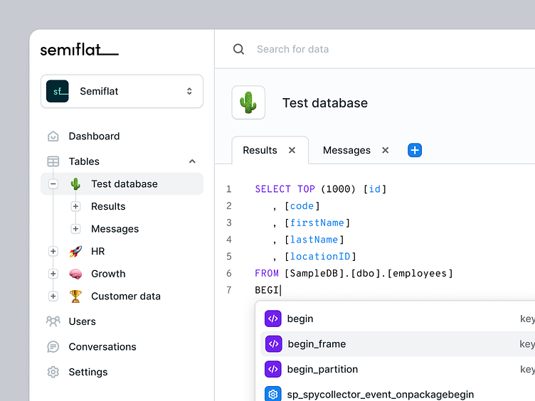
I recently spent some time working on Semiflat's internal documentation summarizing all of the principles that we use to deliver consistent interfaces across multiple project teams. I've created a set of example screens to illustrate all of those principles, along with articles going into dos and don'ts, design tips, and the "why" behind the importance of every principle.
More to come 🚀!
How we define it
Scale describes the relative size of different elements of the interface. To achieve a harmonious and natural look of the design - every element needs to be designed in relation to others so that no layer is unnecessarily large or small to the point it’s barely visible. It’s especially true for text layers which significantly impact the product's usability.
Design tips
1. Start with a body text - The easiest way to build a well balanced interface is starting with the smallest font in your entire system and building all of the elements around it. You’ll be able to compare every other section you design to the “base” text layer and decide how much bigger (more emphasized) it needs to be.
2. Remember about hierarchy - Scale plays an important role in hierarchy (next to contrast and weight). Remember that by making an element bigger, you automatically give it more importance. Compare information and the scale you’re using and consider if the scale choice is consistent with the importance of those elements.
3. Keep it consistent - Stick to a consistent spacing convention in your design - for example, define padding for all cards or spacing between the heading and subtitle as the same value. Make your work easier and build components whenever it makes sense to save time.
Why is it important
Misusing scale has significant hierarchy implications. Dedicating more screen real estate to one section or component will automatically signal to the user that it’s more important. If you’re designing content that’s equal in value to the user, use the same scale not to confuse the user. Scale also plays a role in how well-balanced the interface is and how efficiently the space is used.
If you're looking for a design partner for your next SaaS project, drop us a line and let's talk about how we can help you achieve your goals.
📬 We're available for new projects. Contact us at hello@semiflat.com

