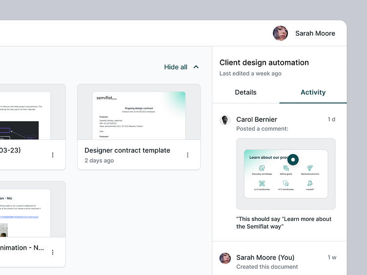
Semiflat principles - Encapsulation
I recently spent some time working on Semiflat's internal documentation summarizing all of the principles that we use to deliver consistent interfaces across multiple project teams. I've created a set of example screens to illustrate all of those principles, along with articles going into dos and don'ts, design tips, and the "why" behind the importance of every principle.
More to come 🚀!
How we define it
Encapsulation refers to the ‘enclosing’ of different elements of the interface, like cards, buttons, and sidebars. Its main objective is to define the area of a component clearly.
Design tips
1. Set boundaries for the component - Use strokes and different color backgrounds/foreground or elevation to communicate the edges of a design element.
2. Separate elements within a component - If you’re designing a component with multiple repeatable rows (like a table), or sections (like an expandable modal), use a border to clearly separate them. This way, users will know that actions they make on one of the elements won’t affect others.
Why is it important
Defining the boundaries of a component gives the user a subconscious message that if they interact with a particular component, they won’t affect other elements. It’s also helpful to communicate the clickable area. If the entire card is enclosed with a border, it sends a message to the user that they can click anywhere within the boundary to interact with that card (especially helpful if the entire card is clickable).
If you're looking for a design partner for your next SaaS project, drop us a line and let's talk about how we can help you achieve your goals.
📬 We're available for new projects. Contact us at hello@semiflat.com

