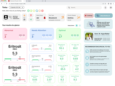
Blood Test Result Screen Page (UX&UI Design)
The aim was to design a physical paperwork we face in our daily lives; such as plane tickets, bills, ATM screens etc... Then we expanded the project by designing their digital screen versions, interactive alternatives. I have worked with a peer during the project and we chose to design the “Bloodwork Papers” according to our previous presentation topics - which was about emotional design & usability. We were careful about using soft colors that won’t panic people, making the patients’ feel cared in a way, giving them customized suggestions according to their health condition.
When clicking to a result a pop-up screen expands and lets you know more about that blood result - what it means, your previous results on it, how low/high your result is, how to improve it etc.
