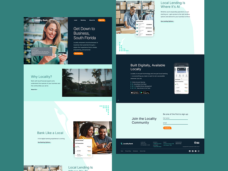
Locality - Bank Like a Local
As the UI/UX Designer, I worked directly with Locality founders and the Nymbus marketing team to create and launch a fully functional marketing site for the Locality app. Together we brainstormed how to scale by making marketing personas and understanding the target customer. I then built out multiple stages of the MVP site, from wireframes to functional prototypes, before handoff to our developers.
Problem and Opportunity:
We wanted to meet the banking needs of South Florida businesses on a local level. We focused on using bright colors and imagery that features the types of SMBs most common in the South Florida area - construction, wholesalers, etc.
Key Stakeholders and their Priorities:
Client: Create a product where SMB owners can upload their tax documents and learn which loans they qualify for
CMO: Create a marketing website that will drive users to bank with Locality and download the app
VP: Does it look sleek and modern while also staying up to accessibility standards?
Developer: How will it function? Will the marketing site be where the tax documents are uploaded or the product itself?
Content Strategist: How can we use the message of "bank like a local" and the South Florida area to compel small business owners to sign up?
Junior Designers: Do the social graphics, swag, and other collateral maintain consistent vision and voice?
Who are the users/audience:
From our research, we found that most SMB owners in the South Florida area were wholesalers, construction contractors, doctors, and lawyers.
Research and Competitor Analysis:
The Marketing team built out an 100-page playbook filled with research on the South Florida area. We built focus groups and establisheed marketing personas around the types of locality customers to anticipate their needs as they interracted with the site.
Strategy
From our research and marketing personas, we came up with an MVP for site launch, then a phase 2 and 3 for future launches. We created a flowchart of pages and their content, then I got to work wireframing. I quickly sketched out a rough outline after our meeting, then built low fidelity and high fidelity wireframes in figma to better understand the flow and functionality.
Visual Design
Here is a sample of a mid-fidelity wireframe of an early draft of the locality site. The dashboard with insights was taken out of the MVP launch, and the scope of the project changed as time went on. We chose to focus on sign-ups in the beginning and deliver more robust functionality at a later date.
User Experience
We wanted to create an experience that made users proud to call South Florida home. Often in web design, your first idea isn't always your best. I knew from the wireframes what the functionality of the homepage needed to be, but I needed to settle on a look and feel for the site that would be inviting, accessible, and drove home the brand vison of "bank like a local." I selected stock imagery of business owners that were cheerful, excited, and dressed in lightweight clothing that fit the climate of Miami and Fort Lauderdale. I also placed a vector silhouette of South Florida behind the feature list, so users would be reminded of the unique advantages of banking with Locality.
Iterate
Every page on the Locality site had multiple iterations. As time went on, more features were added to the app by the product team, so we updated the site to reflect the new direction. Once Locality launched, we wanted to create a feature that would bring Locality businesses together in a professional network. To do this, we created a window cling with a QR code for businesses to advertise their connection to Locality, and the QR code led to a Locality community directory. I researched various business map tools, and iterated on the design, focusing on keeping it simple, clean, and functional.
Final Decisions and Tradeoffs:
The Locality site launched in several phases over the course of 6 months. As I built the site in figma, I created a marketing design system so that the site could scale. The team and focuses changed during the build, so it was important to keep moving, think on my feet, and collaborate with the content designer regularly in figma group sessions. The Locality team was wonderful to work with, and I grew as a designer and learned a ton during this process.


