Local Bookshop's Website Redesign
A redesign of my local bookshop’s website to help improve customers experience and help grow sales online.
Origin Story
I’m lucky to have a lovely local bookshop, but one day I went on their website to find out about an event there and was disappointed by the web experience. It was slow, busy and I struggled to find what I was looking for, so I quickly left.
Now as a Product Designer, I thought of this website again and wanted to improve the experience. But before I started, I wanted to conduct a little research.
I asked a few friends that are also customers of the bookshop to share their experiences. Here’s a quick summary of the key points;
Quite chunky, takes several steps to get to places and not well sign posted
Homepage feels like a long corridor, too much information and scrolling
It’s hard to find related books
The loading is very slow
Doesn’t feel that the bookshop had any categories here
But what’s in it for Sevenoaks Bookshop?
The redesign should also focus on how it can further grow the bookshop’s business.

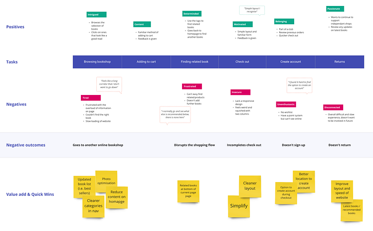
Value added & Quick wins design
I only had 4 weeks to complete this project, so I needed to find the best areas that will help improve the website.
In order to do so, I developed an Experience Map to help bring out opportunities & quick wins to include in my design.
Finding inspiration
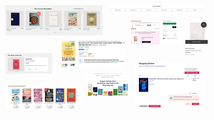
To see what works well on other online shops, I explored their competition and big companies in the industry.
I also looked at other e-commerce sites outside the books industry to find best practices.
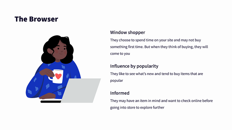
User Archetype
I based my redesign on the Browser Shopper in mind, as this is how the majority of people shop in bookshops.
These are their traits and behaviours;
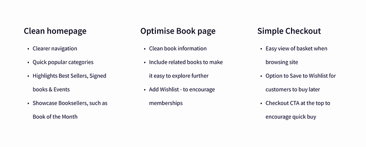
The defined features
Based on my research, here are the features to be included in the redesign.
Bonus feature: Unique Selling Point (USP)
Sevenoaks bookshop is not competing with big companies such as Amazon or Waterstones, but is celebrated for being local, passionate and helpful.
They have an amazing 4.9 stars off Google with many stating how they love the atmosphere and how informed the booksellers were. So including photos of the inside and features such as ‘Staff Favourites” and “Bookseller’s Book of the Month” can bring this experience online.
I also discovered that they won the best bookshop in the Nation (UK) at the end of 2022! This can be a great message to include as part of the Hero and a big selling point to explore their site.
Drawing my ideas down
Following the defined features, I wanted the website to be clean, easy to use and showcase their USP.
At this stage, I gathered as much feedback from potential users and started to iterate my ideas.
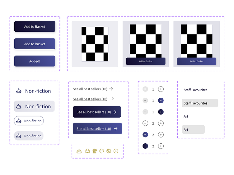
Time to add some microinteractions
I created a component system to include microinteractions to help provide visual feedback and be easier to interact with.
This was a chance for me to explore prototype further and challenge myself. A lot of trials and errors, but I felt it was really important to keep users engaged.
Final design
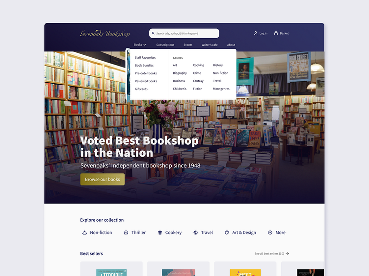
Navigation
With only 5 things to select in the main menu, as well as a login button in the usual place (Jakob's law).
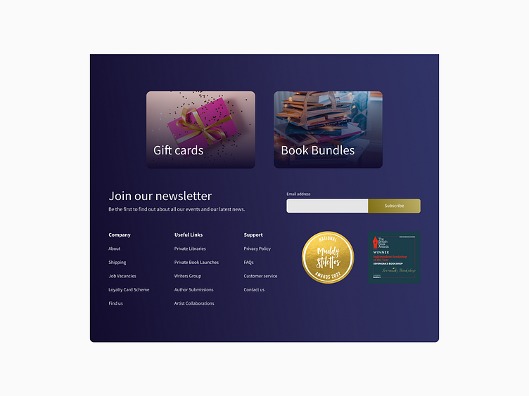
Other pages were moved to the footer.
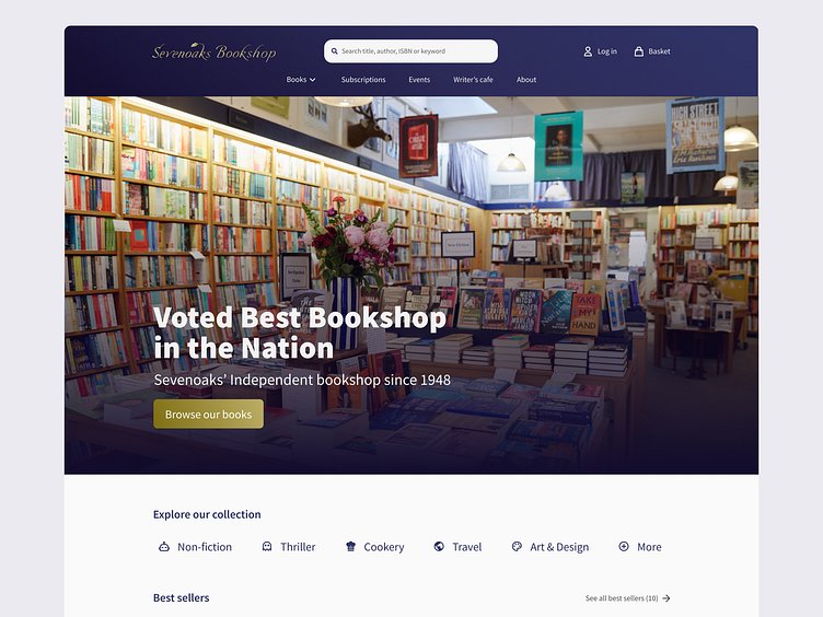
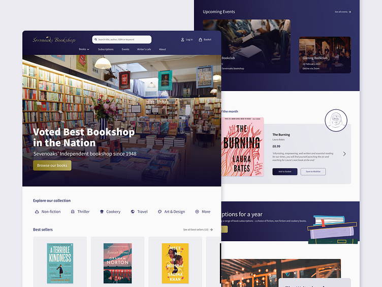
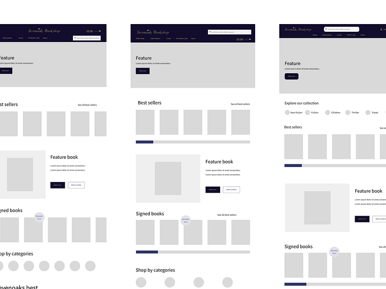
Homepage
I highlighted Best Sellers, Book of the Month and key categories based on my research to help bring potential customers back to see what's new.
Information about the shop, events and cafe was brought onto this page to help customers visit the shop as well.
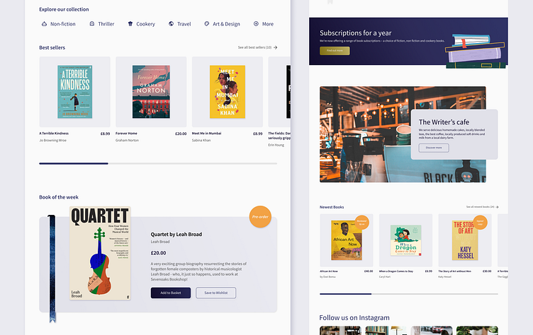
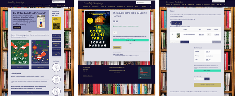
Book page
The page now includes Related books and Save to wishlist to encourage browsers to explore easily and buy later if they wish.

Checkout
Simple layout to focus customers on checking out as soon as possible.
I also included option to 'Save to wishlist' here to encourage buyers to buy later if they change their mind.
Unique Selling Point
Now, this was one of my favourite parts of the redesign as I got to show some personality.
I designed bookmarks for the navigation and Bookseller's Book of the Month so they can be personalised and bring a human touch.
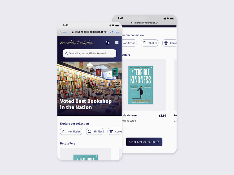
Bonus - Mobile version
Sadly I ran out of time to complete a full Mobile version.
However, I did a quick version for the landing page to see how it would look.
Reflections
I felt that this project taught me the start of how to merge User Experience with Business Strategy.
I really enjoyed thinking about both and how they can help grow a business.
I also learnt many prototype tricks, many being subtle but can create a feeling of ease and friendliness. I hope to explore this further in future designs.
