Erin Condren Redesign
Project Description
Research / Content Strategy / UX Design / UI Design
Over 10 years ago Erin Condren built a $40 million company from the ground up. The company focuses on a line of LifePlanner™ organizers, stationery and notebooks. Recognizing the need for an enhanced online presence, our team initiated a comprehensive project to rebuild the website from the ground up.
To identify areas for improvement, we conducted extensive user testing, monitored customer service requests, and gathered feedback from all departments. Our findings revealed several key pain points:
New customers lacked a clear understanding of the brand's offerings and value.
Returning customers struggled to identify new products, locate sales, and navigate the website effectively.
Most customers were unaware of Erin Condren's diverse range of product categories beyond her planners.
In response to these insights, we committed to provide a more intuitive and engaging user experience for our customers. Our objective was to ensure that every visitor, whether new or returning, can easily explore our offerings, understand our brand story, and navigate the website with ease.
Redesign Goals
The original Erin Condren website presented numerous challenges that hindered overall user satisfaction. Our primary objectives in the redesign were to establish clear hierarchy, maintain a cohesive visual style, improve navigation, and optimize the mobile user experience:
Increase Clarity: The homepage lacked hierarchy, making it difficult for users to identify important elements upon arrival. The various sizes and colors of typefaces created visual clutter, preventing users from focusing on key information.
Establish a Style Guide: Inconsistencies arose due to the lack of a unified style guide among designers at Erin Condren. This led to competing fonts, colors, and photographic styles, creating a disjointed visual experience.
Improve Navigation: The navigation interface was convoluted, featuring multiple icons of varying colors without a clear hierarchy. Product categories were hidden within a push menu, hindering new users from quickly grasping Erin Condren's offerings and requiring extra steps before shopping.
Optimize the Mobile Experience: Promotional images on the homepage were unoptimized, featuring flattened text that offered no SEO value and copy become illegible on mobile devices due to the low resolution.
To address these challenges, our team embarked on a comprehensive redesign project aimed at enhancing user experience across all touchpoints. By implementing a refined hierarchy, establishing consistent design guidelines, simplifying navigation, and optimizing content for mobile devices, we aimed to create a more intuitive, visually appealing, and accessible website with increased conversion.
Competitor Research
In order to inform our design process, I conducted comprehensive research and analysis within the planner and stationery industry as well as across top e-commerce businesses:
Competitive Analysis: I compiled a thorough list of major planner and stationery companies and conducted in-depth reviews of their storefronts, product detail pages, and checkout systems. By capturing screenshots and analyzing user flows, I gained valuable insights into how our competitors manage their customer journey.
E-commerce Benchmarking: I researched and studied design standards employed by the top 100 e-commerce businesses. This analysis provided a benchmark for industry-leading design practices and user experience standards.
Customer Service Insights: I collaborated closely with our customer service team to gather firsthand insights into customer pain points and common complaints. By compiling a list of top issues faced by customers, we gained valuable feedback to inform our design considerations and prioritize areas for improvement.
During this process, I was able to identify best practices, understand industry trends, and address customer needs more effectively. This approach ensured that our website redesign was not only informed by competitive insights and design standards but also aligned with our customers' preferences and expectations, ultimately contributing to a more successful and user-centric digital experience.
Brainstorming
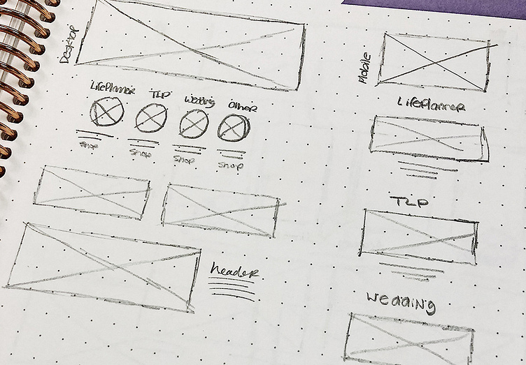
With our goals established, I started by sketching out concepts focused on meeting our key objectives. Given the scale of redesigning a e-commerce website, I adopted an iterative approach by concentrating on individual elements rather than designing entire pages at once.
Establishing Wireframes
The initial rough sketches evolved into refined wireframes that were shared with stakeholders before deciding on which to explore further. Several concepts were considered, including:
Adding large, full-width story blocks to create a visually compelling narrative.
Incorporating handwritten typography for a personalized and crafted aesthetic.
Implementing a Pinterest-style grid layout to showcase products in an engaging and dynamic manner.
Our team selected a winning wireframe based on its ability to effectively showcase various categories and information in a clear and digestible format. This chosen direction not only met the business goals, but also featured a strong mobile-first user experience with highly intuitive navigation.
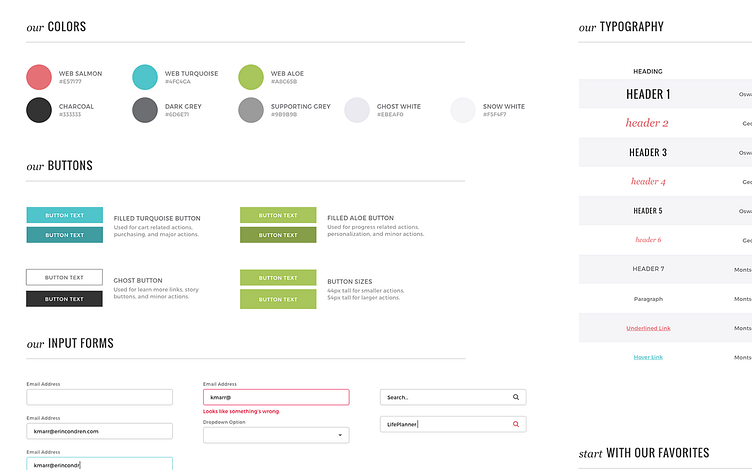
Creating A Style Guide
Creating a comprehensive style guide for the website was imperative to ensure consistency across all platforms. Standardizing the styling for the homepage, including headers, paragraphs, links, and buttons that all designers adhere to, elevated the storefront to reflect the exceptional quality of our products.
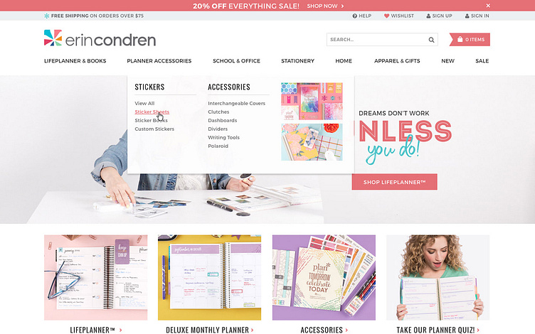
Updated Navigation
The redesigned navigation showcases all primary categories prominently at the top, providing new customers with a clear overview of Erin Condren's product line up. On hover, subcategories are displayed in easily scannable columns.
In line with e-commerce best practices, I implemented an eye-catching notification bar at the top of the screen to drive user action and inform them about limited-time offers. Previously, sales were only promoted on the homepage, potentially leading to missed opportunities if customers landed on other pages.
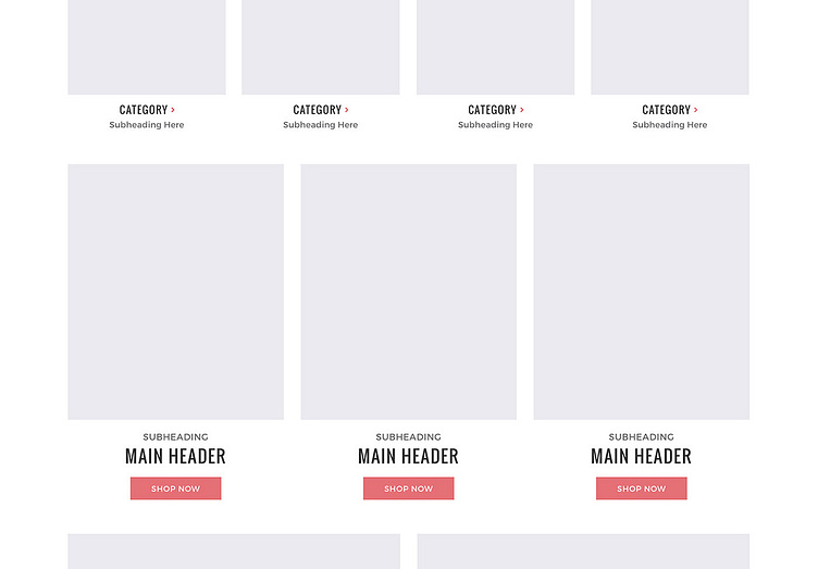
Clear Product Features
To enhance discoverability, I designed four simple blocks below the hero image to visually promote additional product categories. This simple but flexible layout allows us to tailor the homepage to limited time or seasonal offers, such as featuring gift guides during holidays or highlighting student and teacher-related items at the beginning of the school year.
Additionally, I incorporated three blocks underneath to showcase secondary launches and news directly on the homepage. These blocks are designed with ample space for high-quality photography and include clear call-to-action buttons that encourage users to begin shopping.
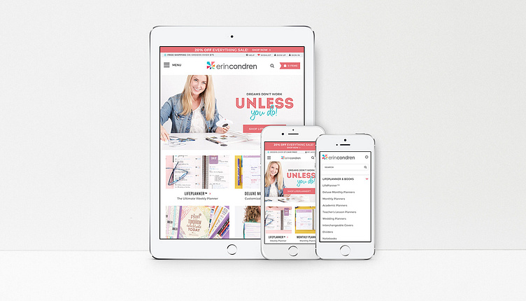
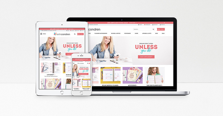
Fully Responsive
The mobile version of our website underwent significant enhancements to optimize readability and navigation on smaller devices:
Improved Text Readability: By implementing live text for all homepage copy, we ensure that all content remains legible and accessible even on the smallest mobile screens.
Push Menu Navigation: To accommodate the extensive product lineup, we introduced a push menu navigation for devices smaller than a tablet. This approach allows users to access a comprehensive navigation menu without cluttering the screen, ensuring a seamless browsing experience.
Mobile Optimized Design: Each section was designed specifically with mobile device screen size and usage in mind, ensuring easy access and intuitive navigation across any device.
These mobile-focused design improvements not only address usability challenges commonly encountered on smaller devices but also prioritize responsive design principles. By optimizing the mobile experience with live text, efficient navigation, and clear category promotion, we provide a consistent and user-friendly experience across all devices, ultimately enhancing customer satisfaction and engagement.
Results
This redesign yielded significant improvements in key metrics, with increased conversion rates and reduced bounce rates. By working closely with the executive team, gathering customer feedback and tracking results, we identified areas requiring further iteration and kickstarted follow-up projects for the team.
The redesigned site boasts a modern aesthetic and enhanced mobile navigation. New customers now have a clear understanding of our product offerings, while returning customers can easily discover new items and promotions. The updated storefront uses captivating imagery to convey a lifestyle associated with our brand, improving the initial impression and showcasing the essence behind our products and brand rather than relying solely on discounts.