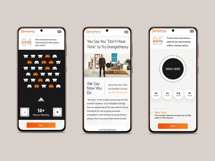
Immersive quiz for Orangetheory
The task was to create a fun, interactive quiz, revealing to users that every excuse they use, is just that an “excuse.“ The timeline for this project was short. So it was vital that I create a fun simple interactive site that users could use on mobile and desktop.
Problem:
Orangetheory Fitness had created a traditional TV campaign to drive people to visit their fitness centers for a free class but had no digital approach. There was also no design created for this approach other than concepts for a pitch.
Objective:
Design a look and feel for this campaign using Orangtheories brand guidelines, as well as creating a digital experiential type responsive site for this campaign that would align with showing users that they had time to work out. Also meet a very short deadline.
My role
• visual design
• digital product design
• system design
• motion/interaction
• design UI design
It begins
Going into this project I was given one week to design the logo and desktop and mobile website. Luckily Orangetheory had great brand guidelines, and user info which helped make this project move quicker. I initially started with design for the logo that would be implements into the site. I knew the logo had to work alongside with the fast moving, energetic side of Orangetheory. After a few iterations the 25th lockup was created. Exploring this logo and its idea began to start thoughts on the the look and feel for the experiential site.
With the logo approval and the data I had from Orangetheory, I was able to began concepting for the site with some key focuses:
• the mobile experience needs to be as immersive as the desktop
• create a quiz type site to call into question use of time
• the build must be easy to implement with the short deadline
Having these goals in mind I dove into the site. Having only a week for my side of the process I could not take my normal approach to a project. My three key points were my guide so I dove straight into sketching ideas. From those sketches I began concepting page and quiz ideas and concepts for the desktop and mobile flow.
After a day of concepting weird outlandish ideas and also gathering more info as I moved forward began to drive a look and feel for the UI and UX direction of this site. I knew the Commercial would be integrated so that would be the largest push but then secondary would be a immersive quiz that felt game like but was just a simple quiz.
Testing
The short timeline effects everything in your builds so with this one it was no exception. I had to build rough prototypes and test internally at Tombras agency 200+ staff by walking up to desks and asking people to try the prototype and provide feedback. This guerilla testing approach to building is tough but works well with short deadlines.
Key findings were:
• some of my game like interactions were sometimes difficult to understand
• developers felt I needed simplify interactions because of the short timeline
• look and feel was very well received
• users felt that it was the most fun quiz idea that they have used
Having this simple but great input from testing was all I needed to adjust and make changes as needed.
From the homepage a user could choose why they were there. If they chose they didnt have time they would be driven to a quiz that would question their daily lines and how they used their time? Questions like, "how much time do you spend watching television?" were asked and they were provided a result at the end informing of the time they used and why they had time to work out at a free Orangetheory class.
I also created animations that increased the look and feel and making the quiz more immersive.
With one week to design and prototype out this site it really turned out well and was provided to client for approval. The Orantheory team loved the interactivity and with some small edits of copy and adjustments for development the site went to the dev team to build. Because they had a lot of input in the initial concepting of the site they were able to jump in early with the simple library that I had been working on.
The site was launched on time with the campaign. Though I was never given numbers Orangetheory did say that the campaign went so well they had to clsoe sign ups early because their locations were filled. I believe that is called success.


