Portfolio Website :: Part 2
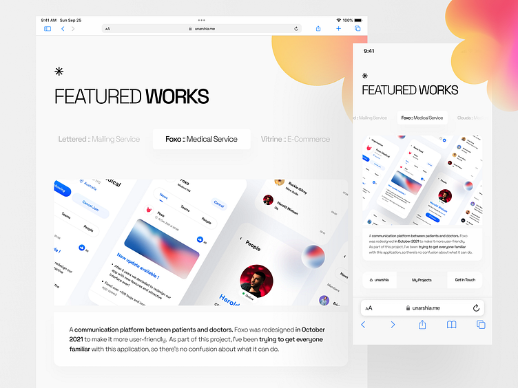
This is another look at my portfolio site. I have always valued combining something visual and something simple as much as possible. I have attempted to present myself in the web3 environment to the full extent of my ability. So let's start at the top. There are two designs here in tablet and mobile sizes. You can view the projects along with their descriptions by moving them like a carousel in the two responsive designs.
On the desktop, however, I preferred to change the carousels into a view that had selective buttons rather than just the projects. It's always about user experience when it comes to simplicity and visuals.
I hope you enjoyed the second part.
Simplicity for the future. :: unarshia@gmail.com
UnArshia's Instagram // UnArshia's Behance
-
Follow Orizon Design:
Behance | Youtube | Twitter | www.orizon.co


