Junecloud Logo 2.0
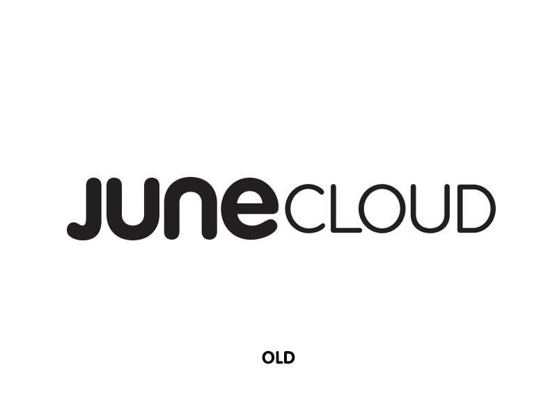
A bunch of little things have been bugging me about the Junecloud logo for a while now. When I started working on a new site I figured it was a good time to revisit it.
The J has bugged me the most—it just didn't fit with the rest of the UNE, or even any of the letters. So I brought the curve out more to closer match the curve of the others. The U and N were adjusted pretty minimally—just a little bit thinner and some subtle changes to the curves. The E was made quite a bit thinner to better match the weight of the JUN. I also added a tiny bit more space between the JUN letters.
CLOUD is very close to how it looked before. The U and D were both pretty rough where the curves met the straight lines, so I smoothed those out as much as I could. The ends of the C have been tweaked a bit also.
